Nuke has beautiful new documentation with quick search and all-new guides. It’s a relatively simple site, but there are a few things I really enjoy about it. This post is a write-up about some design and technical decisions behind it. I’m not an expert in frontend, so take what you see here with a grain of salt.
Sorry for the ambiguity in the title; I’m not suggesting annihilating all the documentation.
Documentation #
There are three main types of documentation:
- Guides: problem and understanding-oriented, focus on both practical and theoretical knowledge
- Tutorials: learning-oriented, focused on practical steps
- API Reference: information-oriented
It’s usually a great idea to start with a tutorial to quickly learn some basics concepts of the frameworks, then go through the guides to get a better understanding of what the framework does and why, and then use API reference for information as you work with the framework.
Great documentation has all three types; so does the new Nuke documentation.
API Reference
I generate API Reference for Nuke using swift-doc. Many people will simply use the Xcode inline documentation, but it’s important to also have it available online. This way, you can link to it, open it on mobile, etc. The line between the API reference and the rest of the documentation should be clear; this is why I host it separately.
Tutorials
As for tutorials, there are a couple, most notably Nuke Tutorial for iOS: Getting Started by Ehab Amer on raywenderlich.com. There was also one written in 2016 by Rui Peres, but it is a bit outdated now because I kept changing APIs like crazy at the time1. Huge shout-out to both Ehab Amer and Rui Peres and the raywenderlich.com team; it’s incredible to see people invest so much time into writing about the stuff you made.
Guides
And now to guides. Guides are a mix of everything: they can describe how to solve a specific problem, explain some high-level concepts, or serve as a subset of an API reference. Most importantly, guides should tell a cohesive story; I think about them as a small book split into chapters.
My main focus was on guides, and this is what the post is also about. I initially started putting them on GitHub, but it was hard to navigate, and I found the experience of using them just in general unappealing. Take simple things like charters per line, for example. GitHub crams 135 characters in a single line, while the ideal is about 90. That’s why I decided to bite the bullet and build Nuke Docs.
Technology #
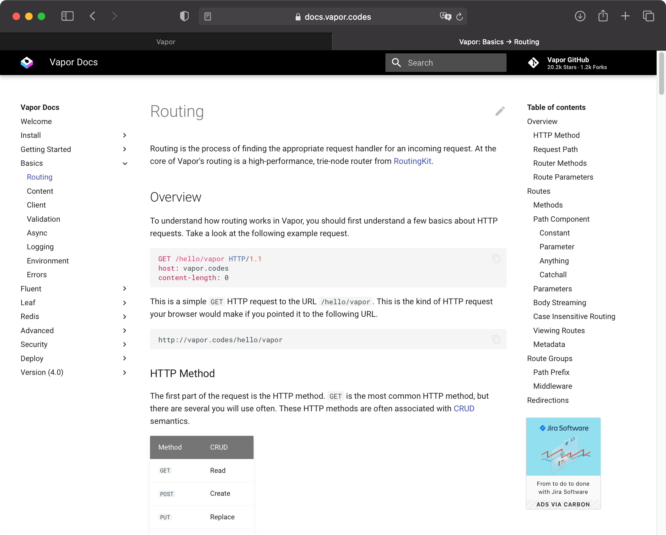
It’s rare for an open-source framework in the Apple ecosystem to have a dedicated site for documentation. Vapor comes to mind; it has a documentation page created using Material theme for MkDocs. It looks great; I love Vapor docs! You can build something similar quickly and easily.
So I’m going to use MkDocs, right? No… I wanted to use the design from kean.blog that many people seem to love. I also wanted to learn a bit more about frontend. So what technology am I using? It’s just static HTML generated using Jekyll, CSS, and, of course, JavaScript. And, you know, I kind of like it, JavaScript.
Design #
I already had a nice design for the main page content from kean.blog with all the features I could possibly need: images, video, side-by-side stacks, footnotes, code blocks, etc. So all I needed was a new navigation model and search.
For the navigation model, I simply used the same design found on Vapor docs. This is pretty much what everyone is using except for Apple.
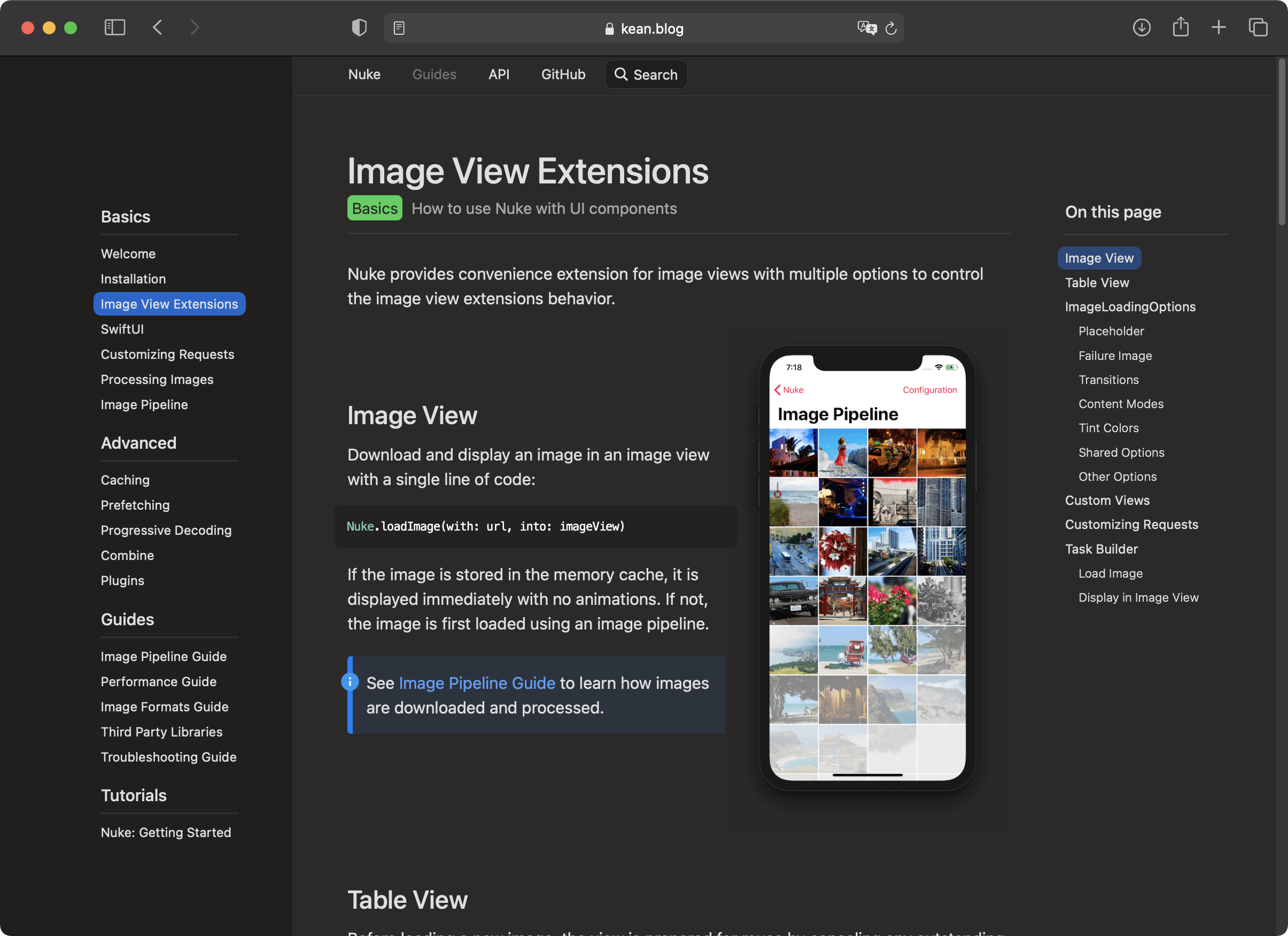
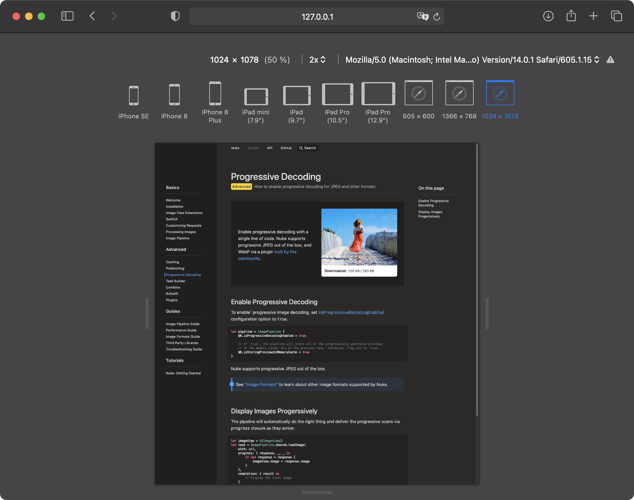
- The header is pinned to the top to give you access to search and other navigation. It is different from kean.blog, where the primary use-case is reading one article at a time2 – you don’t want a header to interfere with your reading experience there.
- A sidebar with the main navigation with a list of all available pages makes it easy to understand which page you currently on and what page is next.
- Each guide has a badge with color-coding to make it even easier to understand where you are in the navigation. A subtitle defines a clear goal for the guide ensuring that the content is cohesive.
- Code blocks, designed to be the main part of the content as the rest of the text – no borders, the same insets as text. In the newest version I even got syntax highlighting exactly like in the default Xcode theme.
- The content width displays ideal 90 characters per line.
- Table of contents lets you know where you currently are on the page, allows you to jump to other sections, and dynamically updates as you scroll.
Responsive #
A great website is responsive: it takes advantage of the big screens while also supporting the smallest devices. I can’t even begin to describe just how easy it is to make responsive interfaces using CSS. There is a lot that native platforms could learn from it. I love CSS; imagine if you had to write all styles in code, ugh.
Of course, Nuke Docs takes advantage of the big screens by displaying all of the navigation elements at the same time.
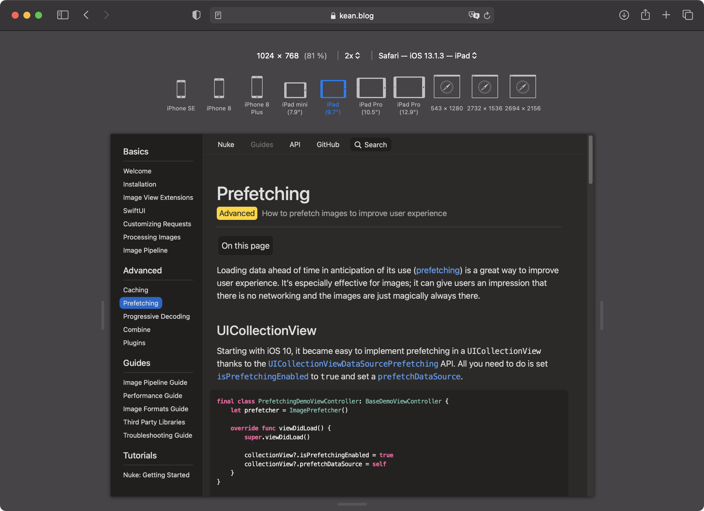
Many people use an iPad as a second screen, and I optimized the site for it. There is space for both the sidebar and the full-width page content (730px).
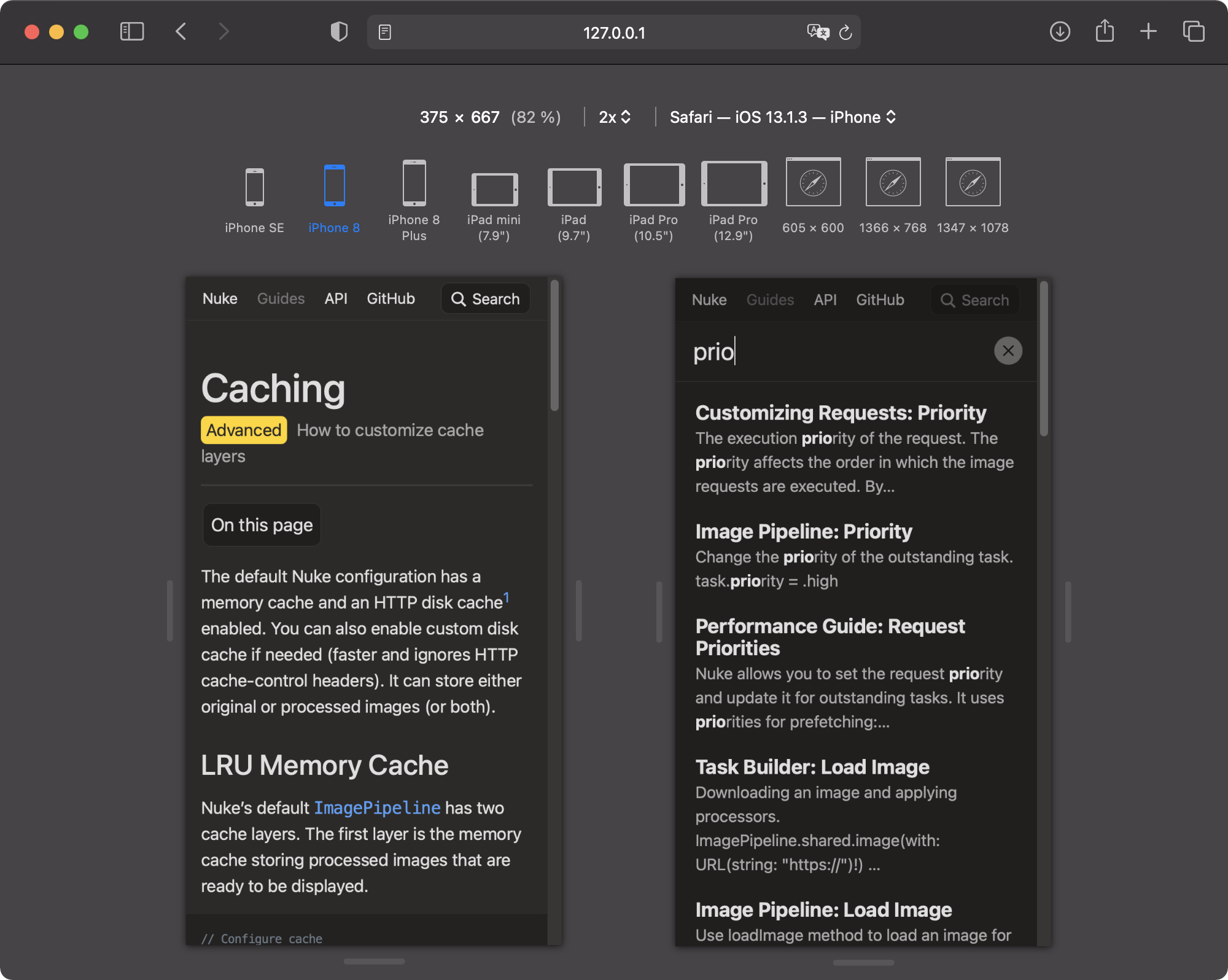
Of course, it also works on iPhones (even on 4”). All features are available on mobile, including the table of contents and even search.
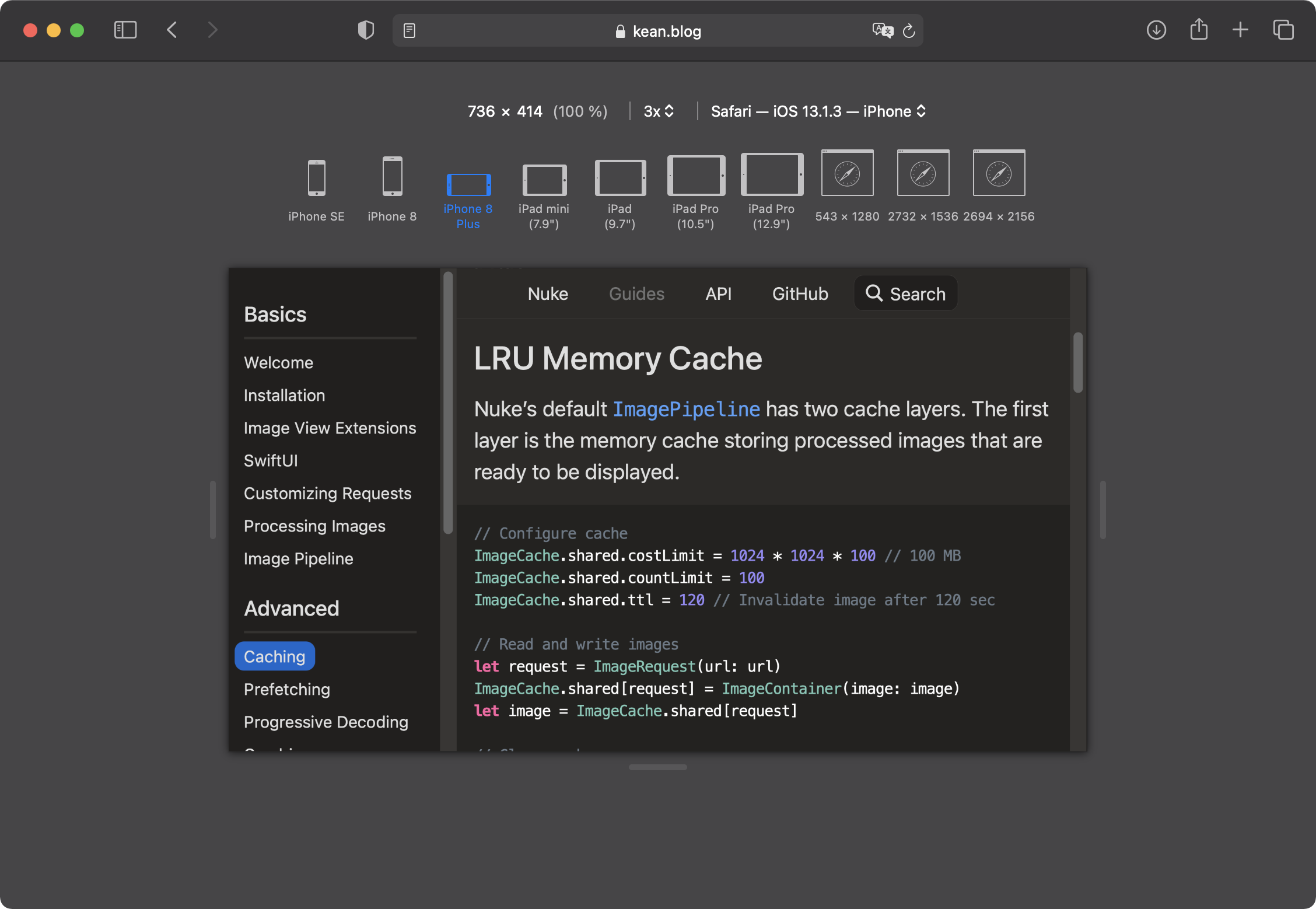
And there is even a layout for big iPhone screens where the width allows you to put a smaller version of the sidebar on the page. If you were to display the page content full-width, it would be comically large. With a sidebar, it’s just right.
Performance #
What is a post without a section on performance? Let’s dive in.
When you open a typical web page, you often see hundreds of resources downloaded from tens of domains. Open a popular website, and see. That’s not necessarily a problem if the resources are small, cacheable, and are required for the best user experience. But with Nuke Docs, I wanted to do with the absolute minimum.
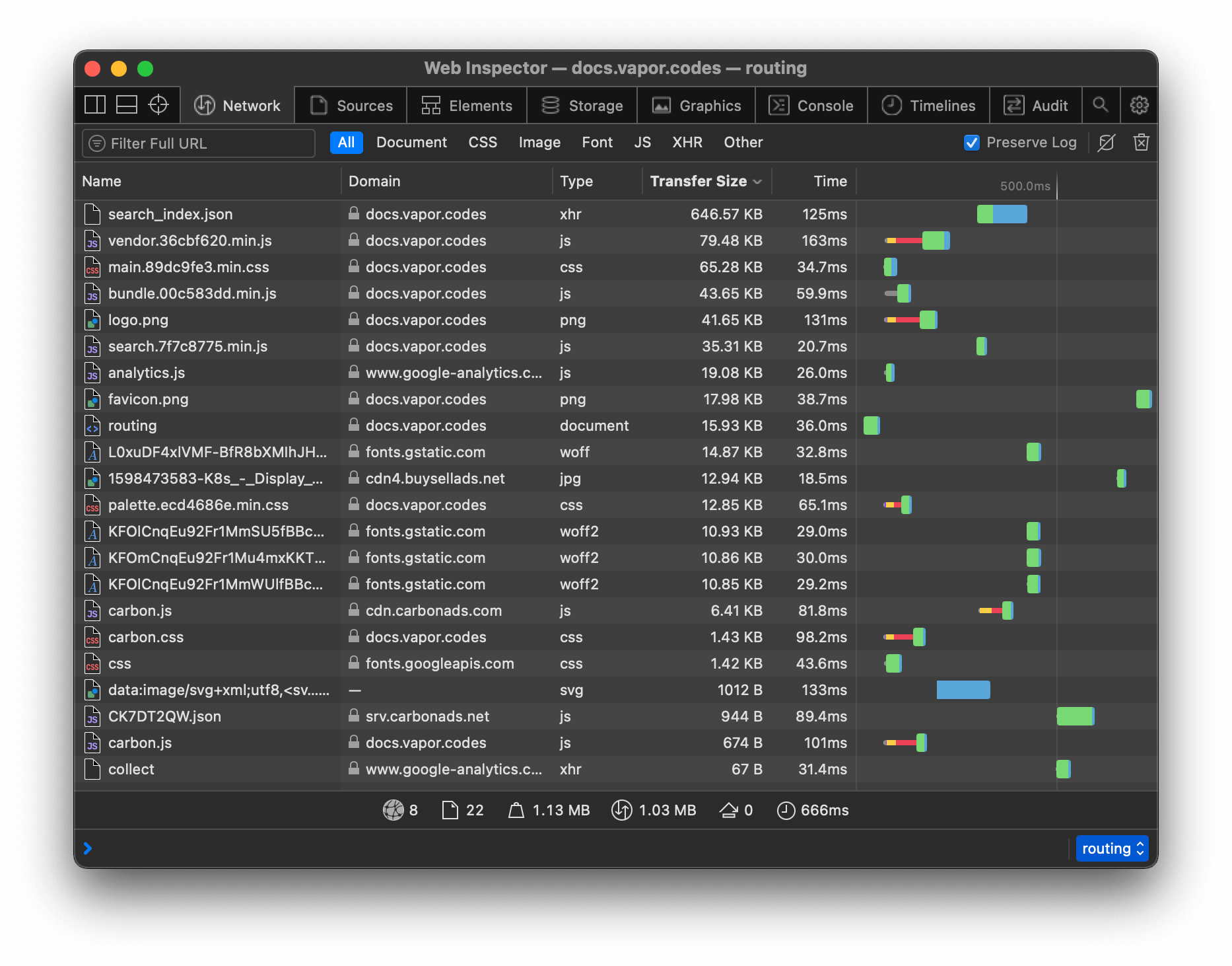
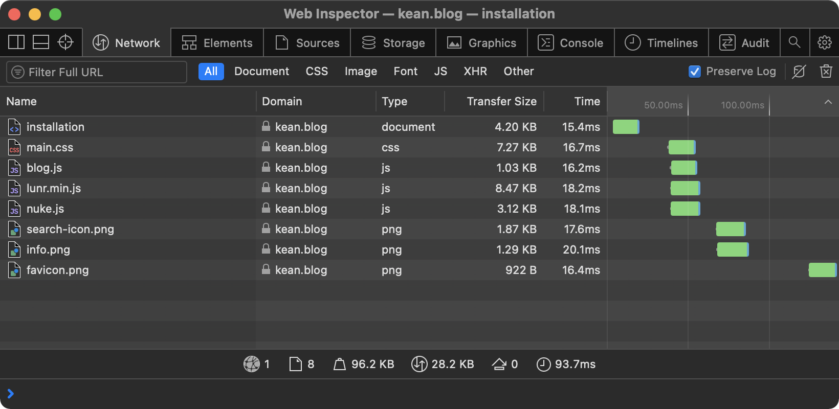
Here are some numbers. When you open it for the first time (nothing in cache), the total transfer size is 28 KB, and everything loads in less than 100ms from a single domain. Sure, it’s a simple page, but check out Vapor Docs networking for comparison: 8 domains, 22 documents, 1.03 MB, 666ms. It’s still super fast compared to other websites. But faster is faster.
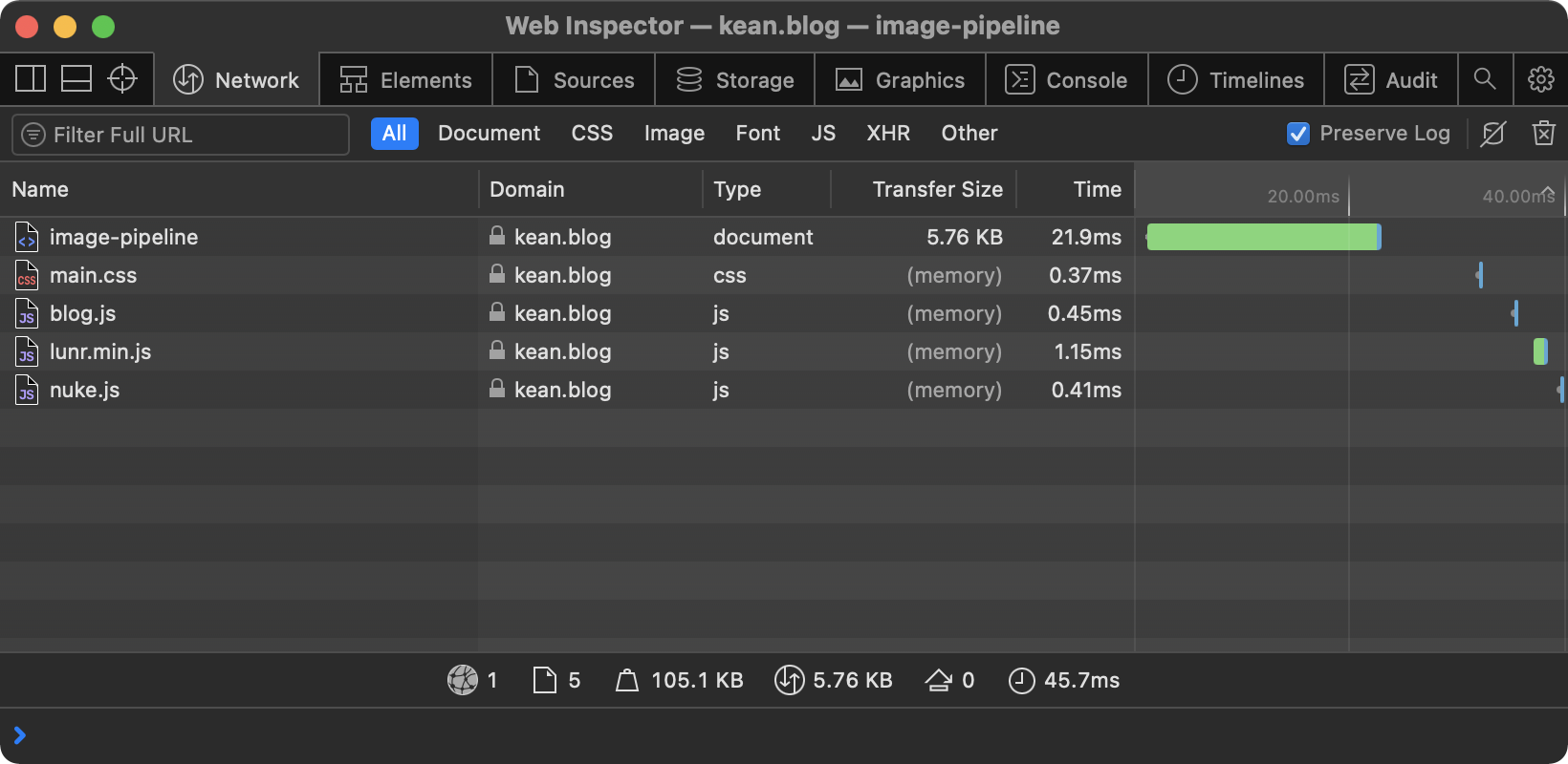
The subsequent page opens are even faster; it’s pretty much instant. The only resource that is loaded is HTML for this page.
How does Nuke Docs achieve this performance?
- Static HTML and CSS, and not a lot of it
- No dependencies except for minified lunr.js for search (<10 KB transfer size)
- No analytics
- Small amount of JavaScript3
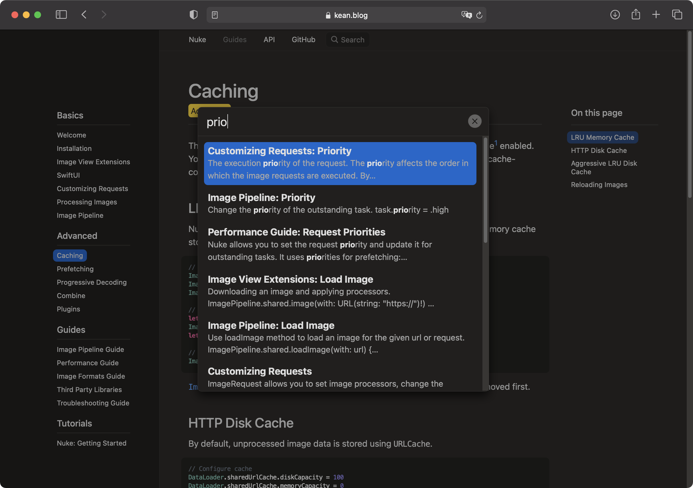
- The search index is loaded lazily when you open search; the time before the user enters the first 2 letters is enough to fetch it
If you want to learn more about how to build the client-side search, see the dedicated post.
I put it in a macOS app as a joke and I’m pretty sure it runs faster than my SwiftUI apps.
Conclusion #
I was waiting until someone compares it to the Apple Documentation, and, sure enough, Twitter doesn’t disappoint. Honestly, I don’t think it deserves that much praise, but I’m glad many people liked it. I wanted to make it as fast and enjoyable to use as possible.
There is still a lot to improve. I wrote some of the guides a long time ago, and the writing there is terrible. I also want to add a cross-site search to show results from the API reference on the main site. And I need a way to automate the creation of links from the guides to the API reference when I mention a type from the framework. But that’s going to be another story.
-
I want to thank everyone who patiently migrated to the new APIs. I used to post detailed migration guides for every major release, but it was still a pain to migrate. Starting with Nuke 7 in 2018 all of the new releases have been largely source-compatible. ↩
-
Speaking about time, I want to mention “time to read” that I recently removed from all posts. You can’t provide an accurate estimate of how much time it would take someone to read a technical article. I think a scroll bar is a good enough indicator of how long the post is. Also, what purpose does it even serve? If someone wants to read an article, they will, regardless of its length. ↩
-
It looks like building a website without a framework isn’t a common affair these days. A lot of the answers online are from years ago, and most use jquery. It’s a bit painful to translate it to vanilla JavaScript every time, but I think it was worth it to avoid a dependency. Some site have 30 lines of JavaScript but downloads 4000 lines of jquery to use one function. ↩