Updates
- Jun 11, 2022. With the latest changes to DocC presented during WWDC22, pretty much all points from this post were addressed.
I wrote a post yesterday about triple-column navigation in SwiftUI. It felt a bit awkward posting it because this really shouldn’t be some obscure knowledge. This is hardly a challenging problem. But to me and to many other people, this was challenging.
Why was it challenging? The NavigationView documentation page doesn’t mention a triple-column layout or macOS at all. But the lack of content is not the only problem with Apple Documentation.
The intention of the article isn’t to complain, but rather to review the documentation system and point out some of its issues.
If you are just starting with development for Apple platforms, there are some fantastic resources available, both first and third-party. You can find them linked to this page.
Navigation #
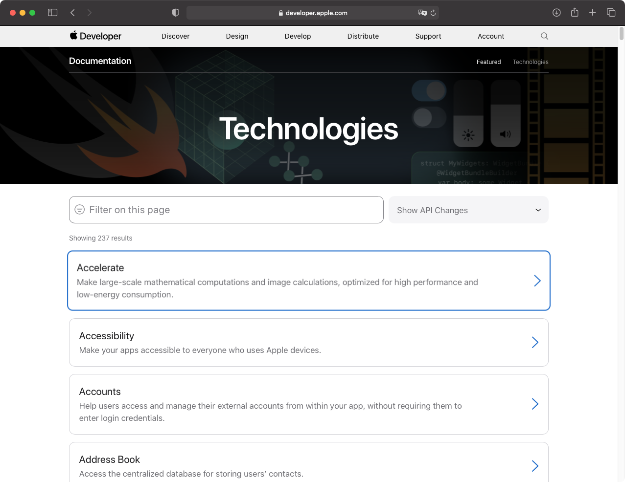
When you open the root SwiftUI documentation page, you see is a small list of topics. In fact, what you see on the screenshot is the entire contents of the home page (apart from the brief introductory text). There is no index where you can see all children pages. You need to drill down multiple pages to find what you are looking for.
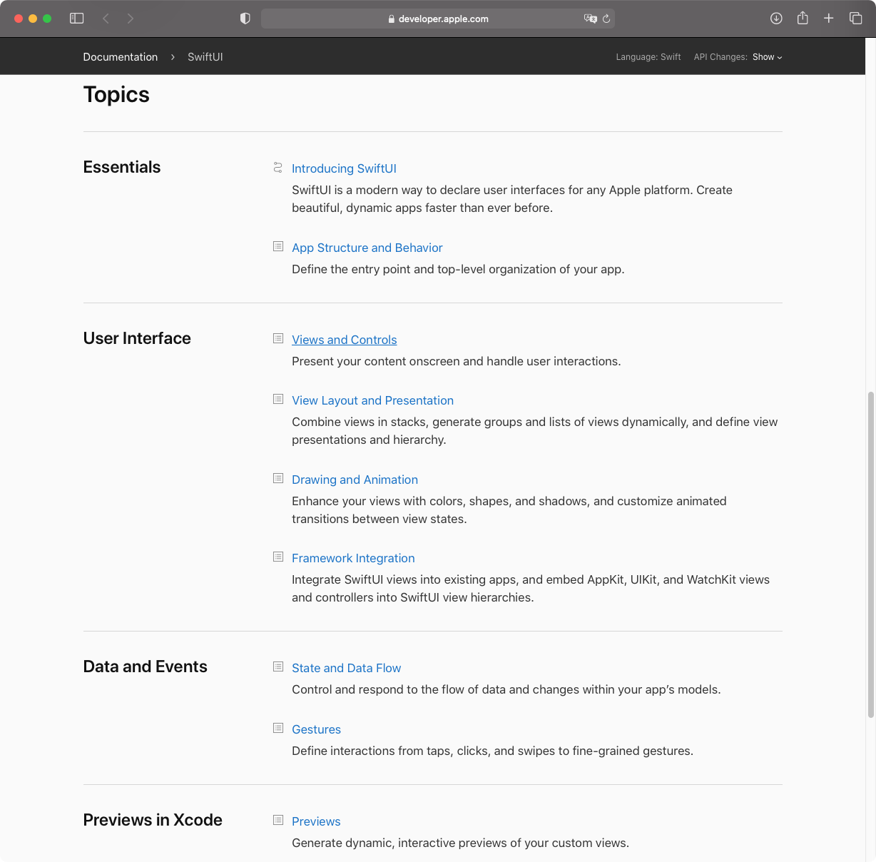
The first item on the list is not part of this documentation, it’s a link that opens the root page containing all SwiftUI Tutorials.
The categories are rather arbitrary. They can’t be specific given how few there are. There is no way of knowing whether what you are looking for is going to be in the category without opening the page first. When you drill down the navigation hierarchy the only sense of where you are in the documentation hierarchy is a navigation strip at the top.
Now, to go to a different page, you need to either navigate back or hope that the links in a “See Also” section at the very bottom of the page are going to be relevant to you. The image next to “See Also” links indicates that it is a dropdown. It isn’t, it’s just a link.
If you want to compare it with how it could be done differently, here is a screenshot from developer.android.com
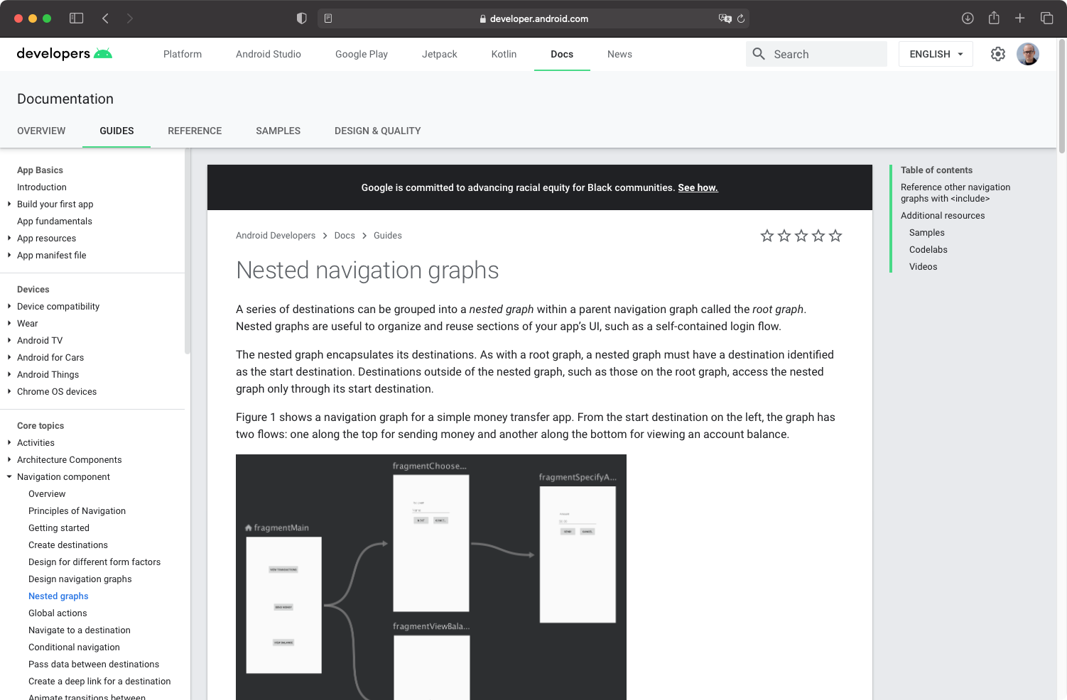
There are many things that Google does right on this page. First, unlike Apple documentation which appears as it was designed for mobile, Google takes full advantage of a bigger screen and it also works great on mobile. Second, you get a full overview and control of the navigation:
- A complete and prioritized index of pages to the left with sensible categories
- You can navigate different types of documentation using tabs at the top
- There is a table of contents on the right, Apple doesn’t have that
But this is comparing apples to oranges. The Google documentation page is what a developer looking to build something for Android sees. It covers all topics, including basics, architecture, navigation, persistence, deployment, etc. I was comparing it with the SwiftUI page. What does the home page look like?
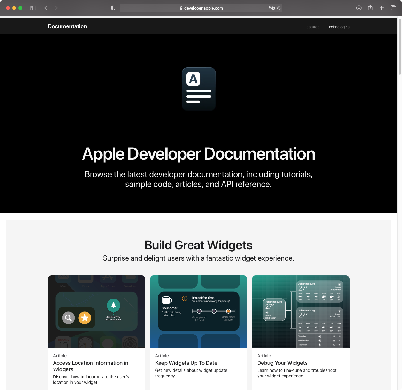
The “Featured” tab is slick, minimal, but hardly useful. And the “Technologies” tab is an alphabetically sorted list of everything there is. Documentation should be a comprehensive system with multiple types of content.
Types of Documentation #
There are generally three types of documentation:
- Tutorials, learning-oriented, focused on practical steps
- Guides, problem and understanding-oriented, focus on both practical and theoretical knowledge
- Reference, information-oriented, typically a complete list of all available APIs
Tutorials #
Tutorials are generally the easier types of documentation to write. You take a specific problem and describe the steps to solve it. They don’t need to provide deep knowledge, they don’t need to be complete, and they can overlook certain aspects of the technology. For example, Triple Trouble took me 20 minutes to write, SwiftUI Layout System - more than a week.
Back in the Objective-C days, Apple’s focus was on providing guides offering a deep understanding of the topic. With SwiftUI, the focus switched to tutorials. These are nicely produced, but that raises concerns about prioritization issues. As a result, Apple now writes tutorials, and the community writes The Complete Guide to NavigationView in SwiftUI. The situation is backward.
Guides #
Apple still writes guides in some form. But there is a problem – they are too short, too basic, and too hard to find. You typically want to separate different types of documentation because they all serve different purposes. Google does this, but Apple does the opposite. There are different documentation types are mixed in a bland mass of gray with an unconscionable amount of white space.
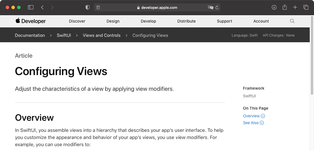
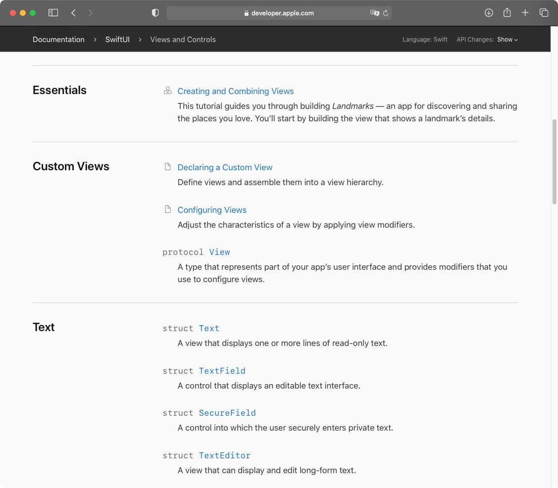
For example, on the screenshot below you can find a tutorial, two guides, and multiple references. This page could benefit from color differentiation.
API Reference #
The goal of a reference is to provide a complete list of the available APIs with some basic description of how these APIs work. A reference can be auto-generated from code, assuming you have inline documentation. For example, Nuke reference is generated using swift-doc by mattt.
You often don’t even need a reference as a document. To learn about APIs, you can use inline documentation in Xcode. And for a deep understanding of topics, you use guides. This is again why it’s generally a good idea to separate a reference from a guide. In Apple documentation, things are more complicated.
Let’s take NavigationView page as an example. This page is classified as a reference which is indicated by the fact that there is no icon and it says “struct”.
But when you open the page, there is a mini-guide there.
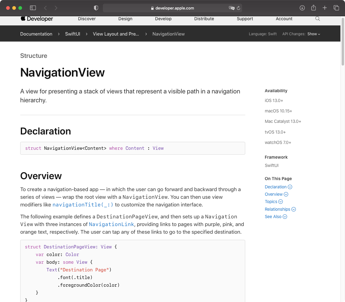
And the reference? Empty.
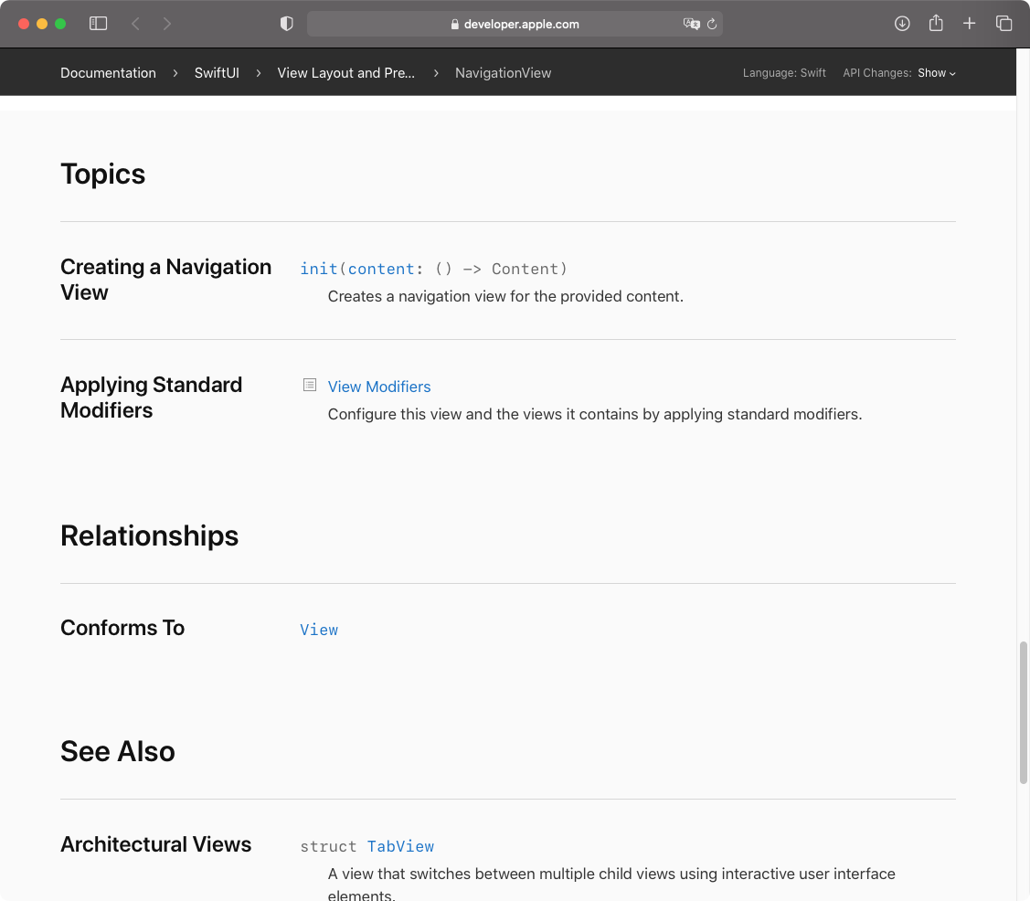
This page doesn’t serve as a reference. For example, there is no way of knowing from this page that you can apply a navigationViewStyle(_:) modifier to NavigationView. Apple themselves made it hard to generate a good reference for SwiftUI because of the way APIs are designed using generics. This problem appears not only in the documentation, but also in code completion, and in other systems that were not updated to accommodate the SwiftUI API design.
This page also doesn’t serve as a good guide. NavigationView is one of the most complex components in SwiftUI, it requires much more than a page of text to describe.
API references in Apple documentation often have these hidden mini-guides in them similar to the one in NavigationView. But you never know which page is going to have a mini-guide and which isn’t. As a result, when you can’t find enough information you have to fish for these mini-guides scattered all over the API references to find at least some information.
There are other little things that make this not a great API reference. As shared in this tweet by Max:
- Functions from extensions aren’t grouped
- Extensions with constraints don’t state the constraints
- Long argument lists have no indentation
Video #
We all know this one. WWDC videos are no longer complementary to the documentation. They contain crucial information that can often only be found in these videos. For example, the only place (that I found) where you can learn that XCFrameworks can’t have Swift package dependencies is the very end (38:16) of a WWDC video from 2019. Videos are not searchable. Even if you saw the video during WWDC, there is no quick way to remind yourself of what it was about.
Conclusion #
Apple documentation used to be one of the best in the industry. It can be so again, but it requires a lot of changes that are not confined to improving the content. This post doesn’t claim to be some deep analysis, but there are enough issues that are on the surface.
Apple can’t continue relying on the community to fill the documentation gaps. The APIs are getting updated and a lot of the SwiftUI content created by the community will have inaccurate and misleading information soon. This is already happening with many posts about NavigationView, List selection, etc.