Today is my 10th anniversary of programming for Apple platforms, and what better way to celebrate it than with a new major release – Pulse 3.0 is out!
I loved every year I worked on iOS. I started in 2012 with Objective-C and now, thanks to Swift and SwiftUI, I’m able to target all Apple platforms, which is incredible. Pulse 3 is a complete overhaul. It enhances the experience and achieves nearly complete feature parity between iOS, macOS, watchOS, and tvOS with the same codebase.
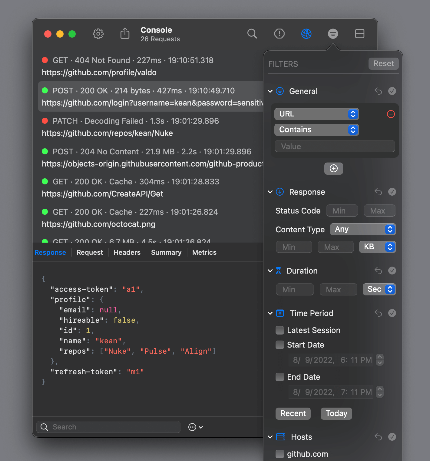
Pulse is a network logger built with SwiftUI. It integrates on the
URLSessionlevel allowing it to see unencrypted traffic and record task metrics available only on this level.
iOS #
The original version of Pulse was designed quickly and targeted only iOS, so many of the decisions were incompatible with other platforms. Fortunately, for nearly every issue, there was a better solution that also enhanced the experience on iOS while simplifying the code.
Inspector #
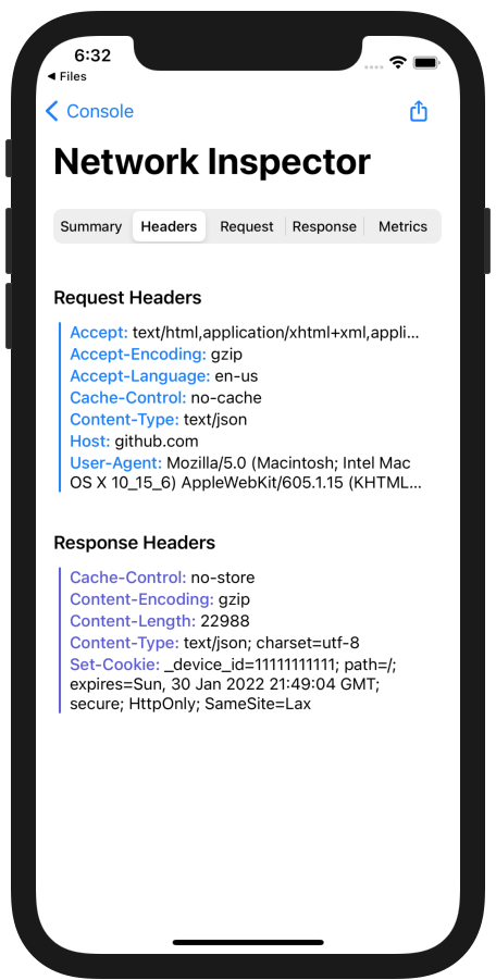
The most dramatic changes are probably in the network inspector. The previous version had a convoluted navigation with a segmented control in the navigation bar that was hard to reach and didn’t scale for adding more features. More importantly, it was incompatible with other platforms. This design was there from 0.1 and it was time to improve it.
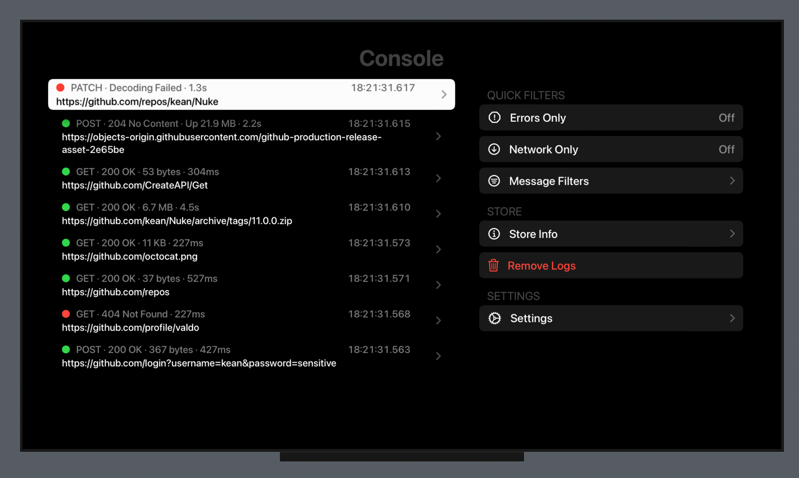
The simplest solution is often also the best. The inspector now uses a simple List with navigation links. The new version is clearer and surfaces important information. The primary navigation areas such as response and headers viewer are now much easier to reach because they are closer to the bottom of the screen.
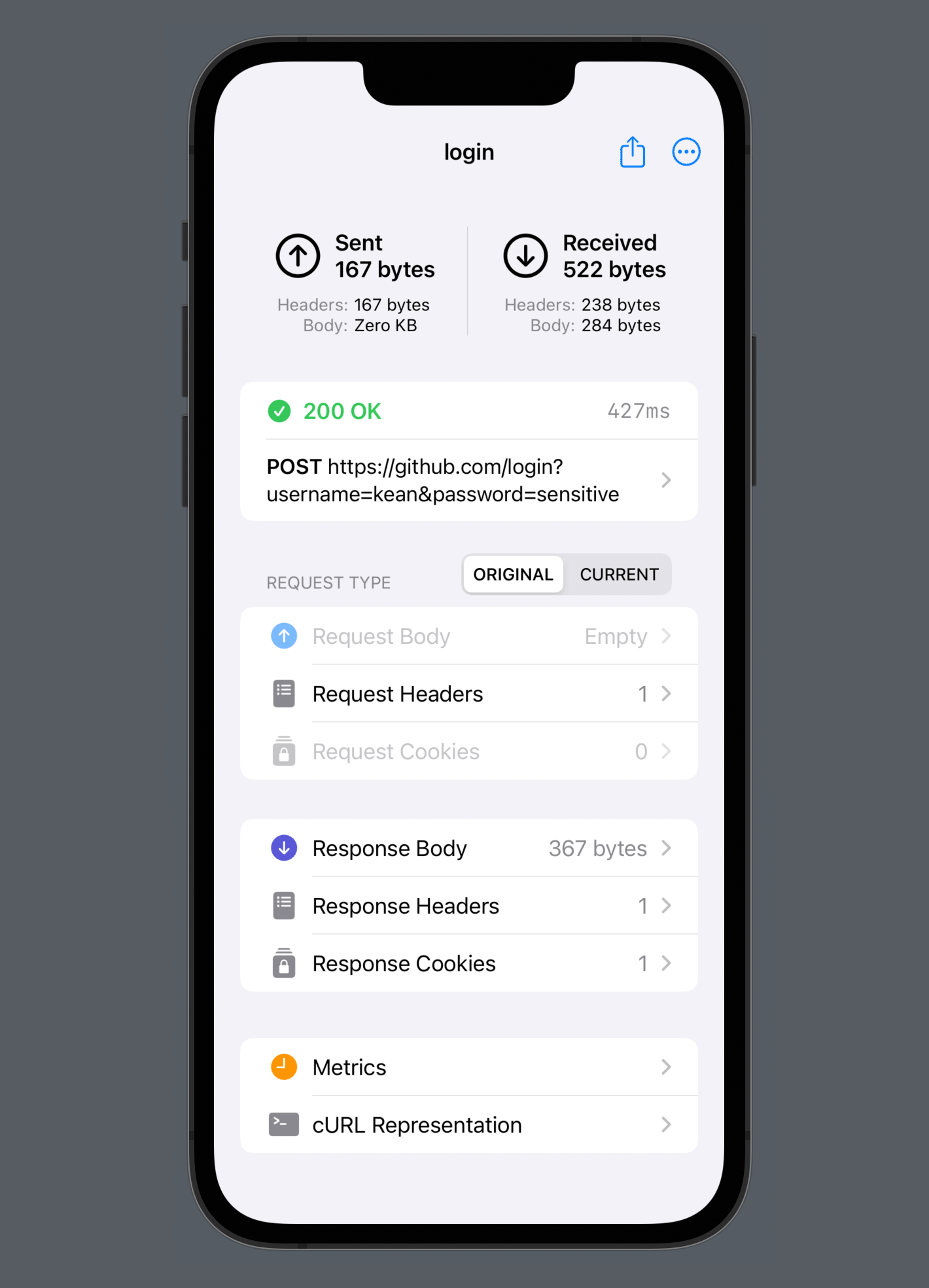
The new navigation freed a lot of vertical space. The difference between the old inspector and the new one is stark. Before, the response viewer had an ad-hoc “show fullscreen” button. Not needed anymore. When you click “Response”, you are effectively already fullscreen now.
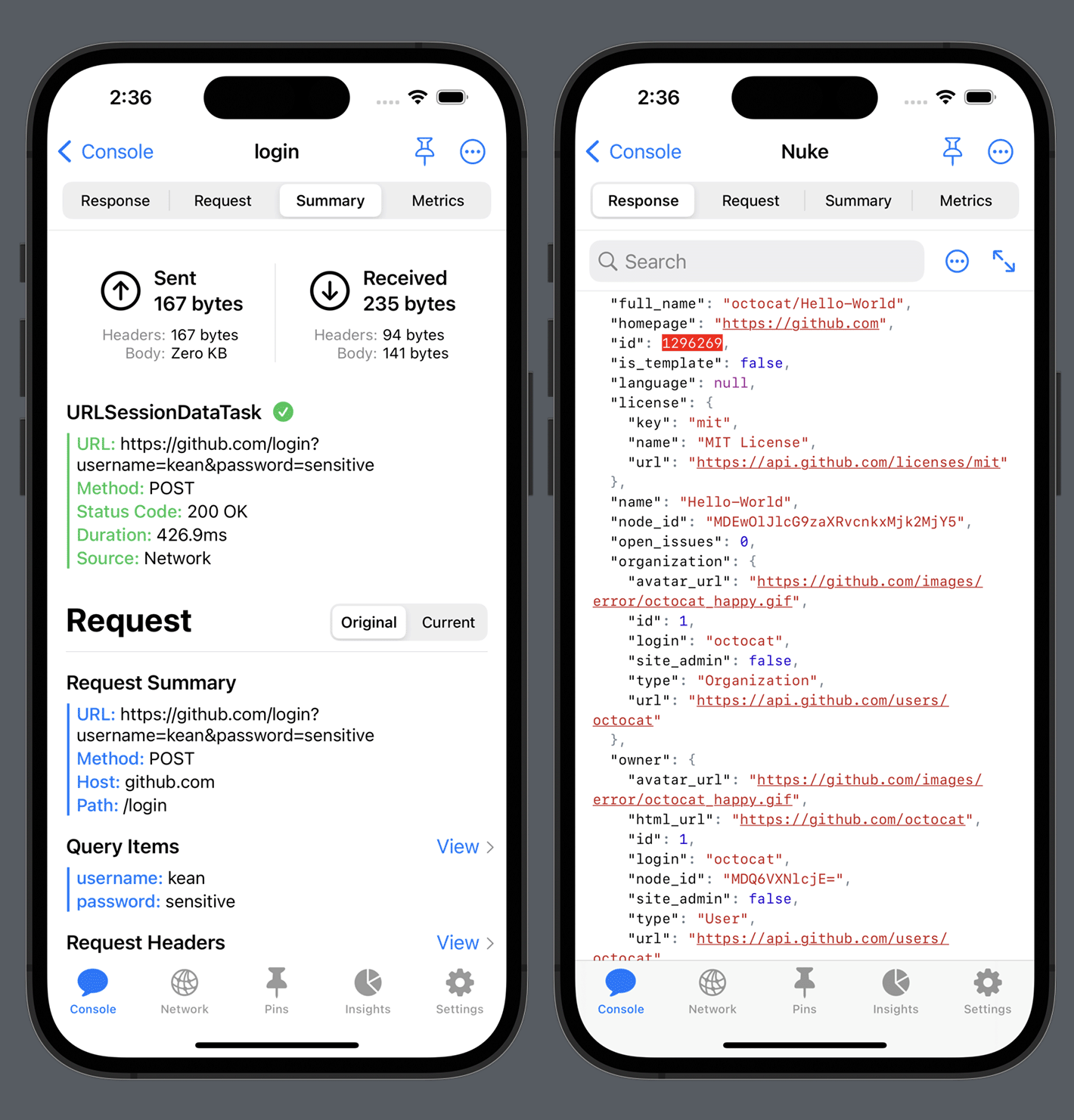
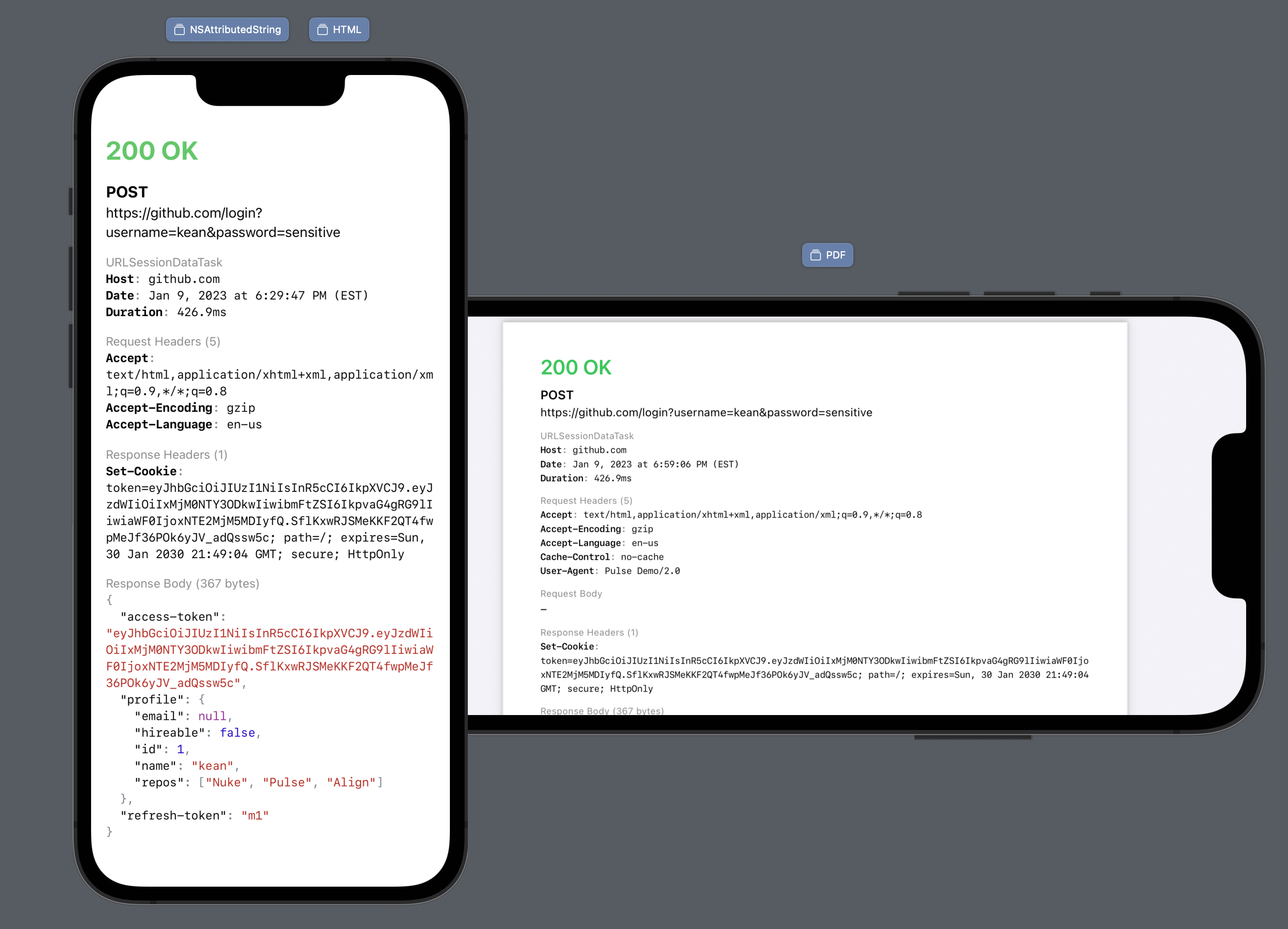
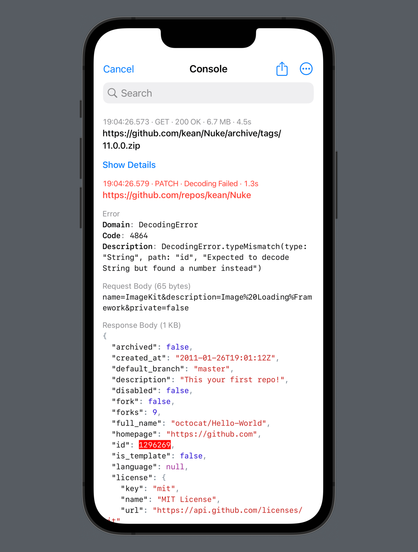
The response viewer itself is pretty cool because, unlike regular HTTP proxies, it can display decoding errors. And it’s even better now because the theme of “more vertical space” extends to it as well. I adopted searchable API so that the search bar now disappears when it’s not needed. And I also redesigned the toolbar for jumping between search results. It is now displayed in the bottom-right corner, freeing even more vertical space.
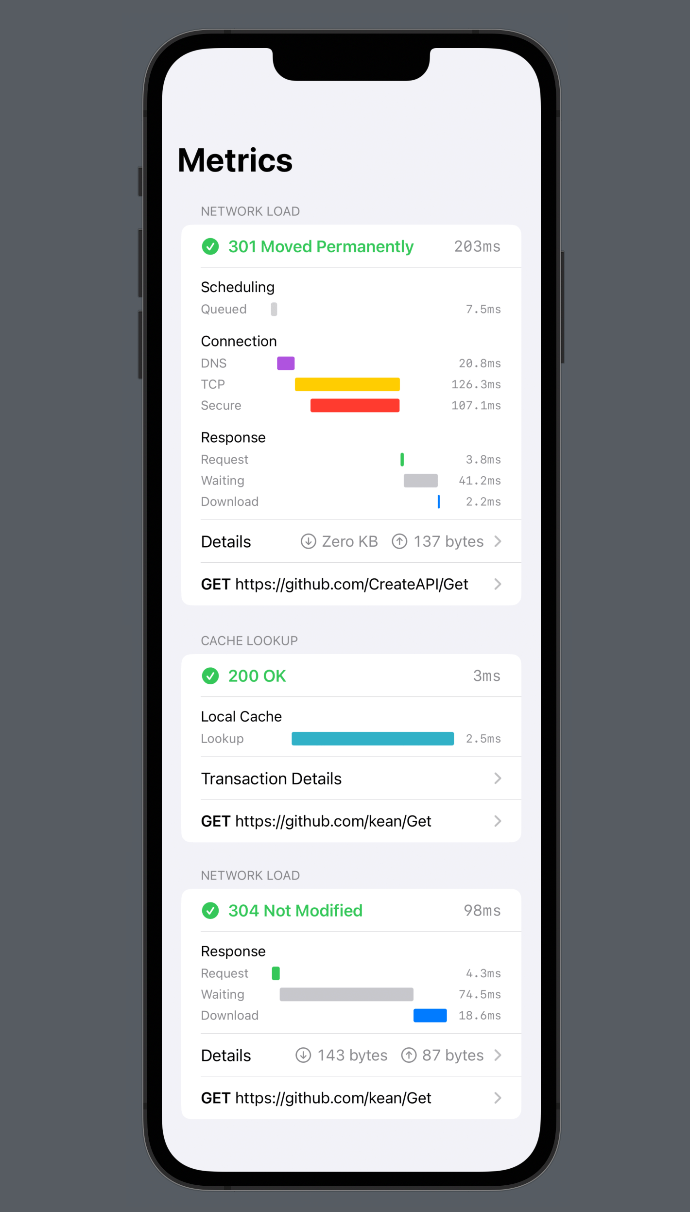
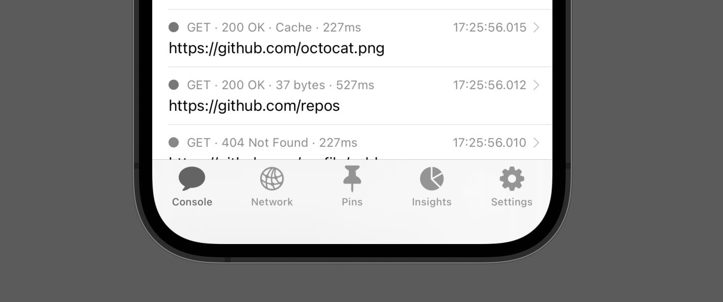
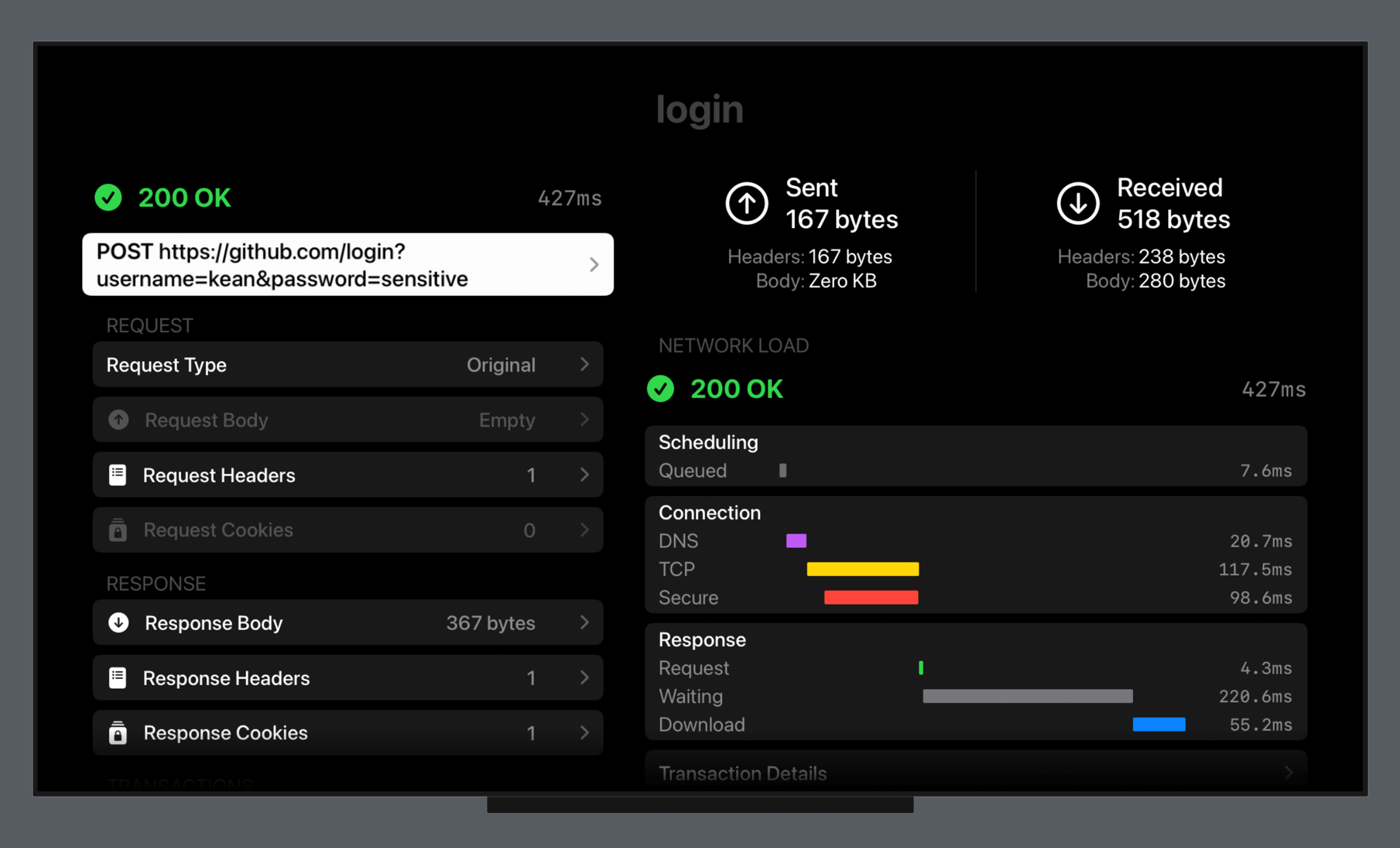
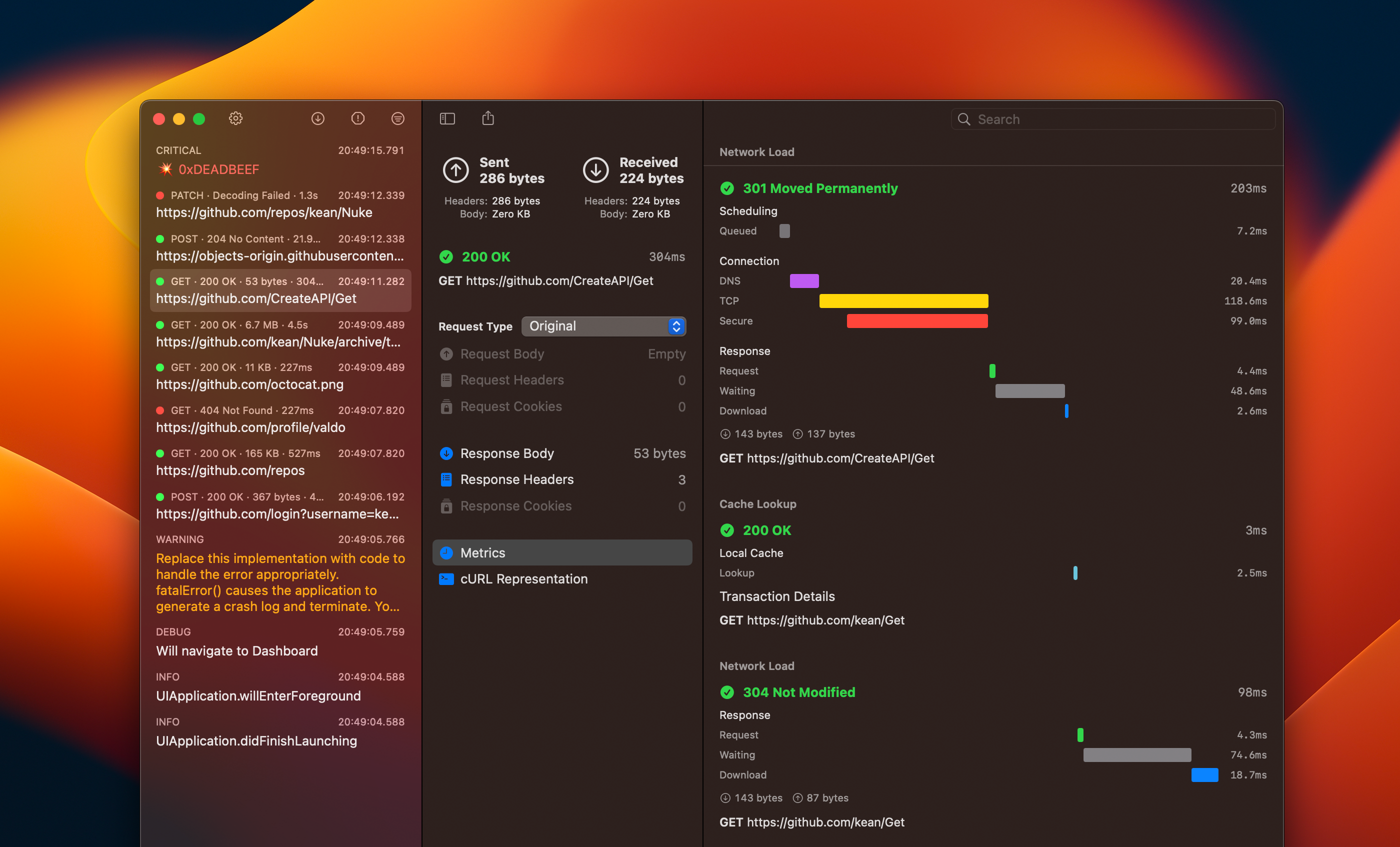
The metrics screen is also redesigned. It now clearly shows all individual transactions along with their fetch types and other details. It’s now much easier to understand the lifetime of a request.
In the following example, you immediately see that the task had three transactions: the first request was redirected with 301 (Moved Permanently), followed by a cache lookup with another request to validate it that returned 304 (Not Modified).
Text #
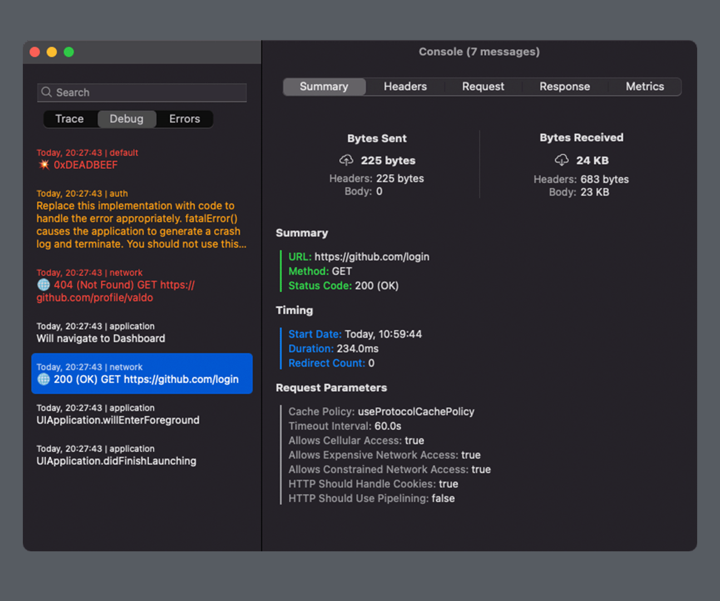
Text is often the best interface, and it’s everywhere in Pulse. Where previously you had non-selectable labels, it now uses fully featured text views with text selection, search, and sharing. There are also two new sharing options: HTML and PDF. I’m sure a lot of people will be particularly excited about PDF, especially if you print out code at work. To power these features, I had to rework how I create strings because the previous approach of writings different “renderers” for different outputs didn’t scale well.
In the new system I render things – messages, tasks, response bodies – into attributed strings. The strings are then converted into the requested output format: NSAttributedString -> HTML, NSAttributedString -> PDF, NSAttributedString -> Plain Text. It’s much simpler and produces consistent results. SwiftUI previews were a massive help to iterate on it.
Navigation #
The main navigation also changed in Pusle 3. The MainView from the previous version had a tab bar, which is a good choice for most iOS apps, but not for a tool that you are integrate into an existing app. Most large apps already have their own debug menus and they want to integrate Pulse there.
In Pulse 3, the navigation is now centered around a single screen: ConsoleView that you can either push or present. The Network and the Pins screens became simple filters. And Insights and Settings are now accessible from the new context menu. It also provides quick access for common actions, such as removing logs.
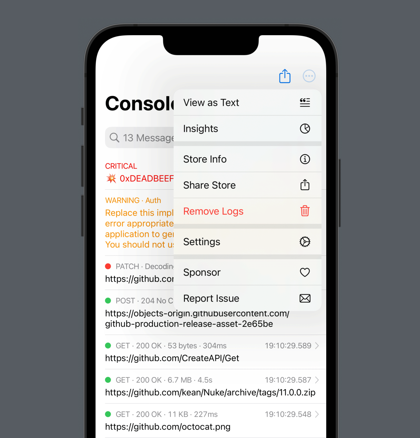
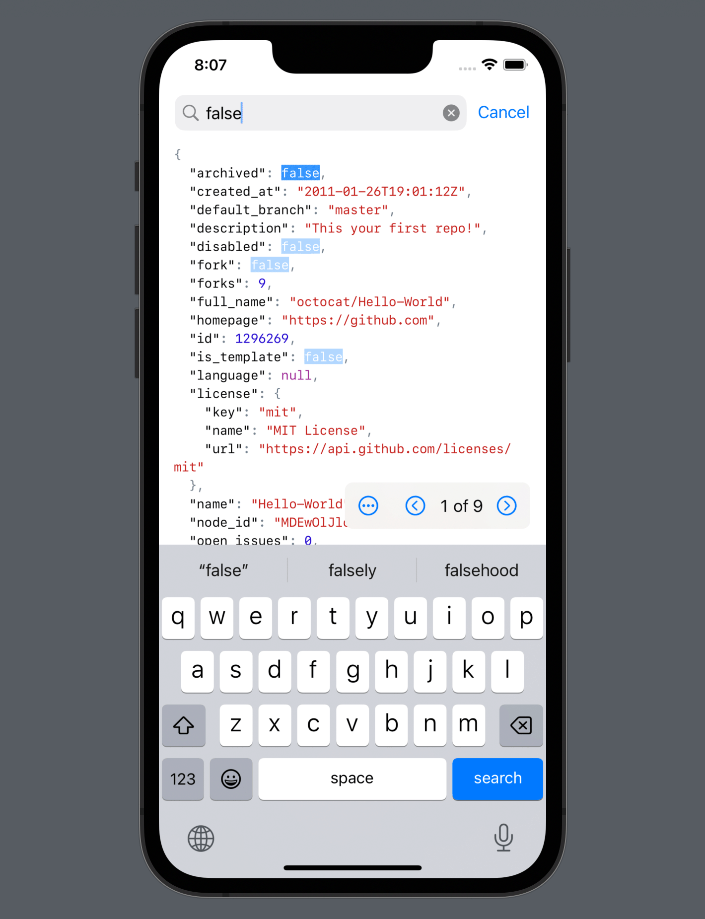
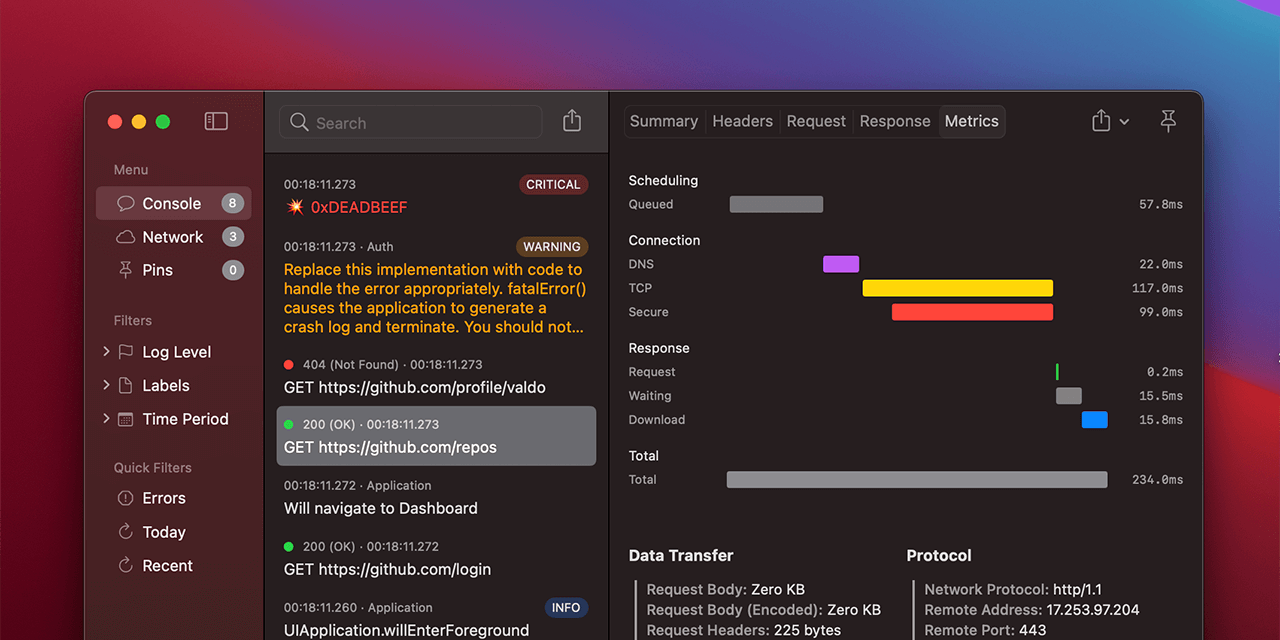
View as Text is yet another new text-based feature. It renders the entire console output as text. But it’s not static text: you can still apply filters, search, expand and collapse network requests, and more. And just like the response viewer, it displays decoding errors inline (see “id” highlighted in red).
Storage #
The storage improvements were the primary focus of Pulse 2: massive space savings, improved document format for sharing, and fully SQL-compatible storage – these are just some of the changes it introduced. With this solid foundation, I was able to focus on PulseUI in this release, but there are some improvements to the core framework as well. For example, NetworkLogger now has convenience APIs for filtering out sensitive data or just something you don’t want to be logged for other reasons.
let logger = NetworkLogger {
    // Includes only requests with the given domain.
    $0.includedHosts = ["*.example.com"]

    // Exclude some subdomains.
    $0.excludedHosts = ["logging.example.com"]

    // Exclude specific URLs.
    $0.excludedURLs = ["*/log/event"]

    // Replaces values for the given HTTP headers with "<private>"
    $0.sensitiveHeaders = ["Authorization", "Access-Token"]

    // Redacts sensitive query items.
    $0.sensitiveQueryItems = ["password"]

    // Replaces values for the given response and request JSON fields with "<private>"
    $0.sensitiveDataFields = ["password"]
}
Both
includeandexcludepatterns support basic wildcards (*), but you can also turns them into regex patterns usingisRegexEnabled.
tvOS #
Now let’s talk about the big screen – Apple TV. The original iOS-centered design was largely incompatible with other platforms. But with the new simplified navigation, I was able to use the network inspector and console with almost no changes on tvOS (and other platforms, but more on that later). I was stunned when I ran the new SwiftUI codebase on these other targets – it just worked. I needed to make only small adjustments. Well, of course, I’m also using native design, so many things come for free.
The main thing I did end up tweaking on tvOS is navigation to take advantage of the big screen. I combined two navigation stacks on a single screen, both in the console and in the network inspector. This way you can access common features, such as filters without ever leaving the console. It also enforces acceptable width for lists so that the existing cells from iOS work well in this context.
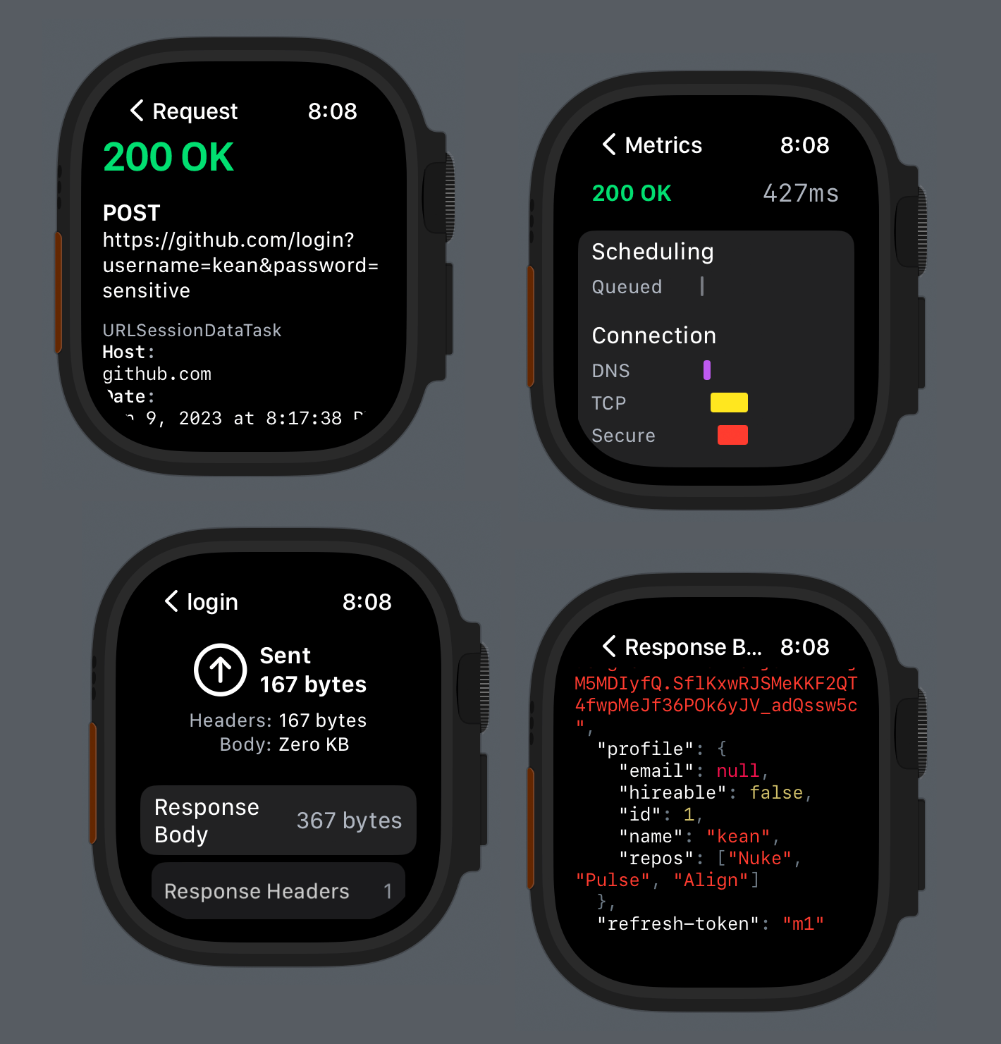
watchOS #
The watchOS version got a complete overhaul as well and now has nearly complete feature parity with iOS. If you enjoy hiking with your Apple Watch Ultra and have a watchOS app to test – great. You can record and preview logs directly on the device. And when you are ready, you can easily share and view them on a bigger screen.
You can also connect to any device running Pulse remotely with Pulse Pro and view logs in real-time on your Mac.
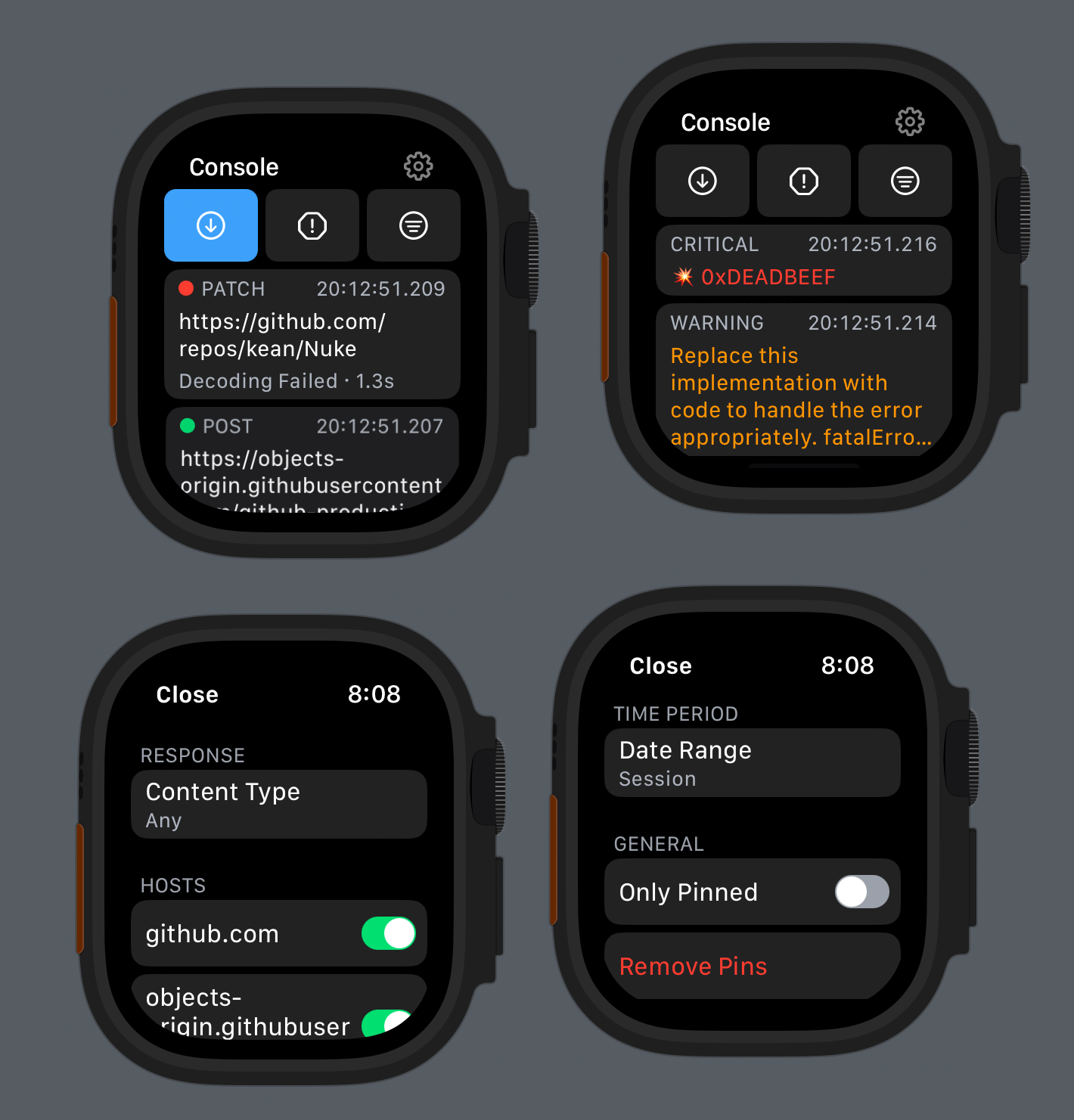
I got a lot of features “for free” after reworking the iOS version. For example, console and network filters that were initially developed for Pulse Pro now work on all platforms (and with nearly zero conditional code). But there are also some new SwiftUI APIs I integrated on watchOS: AttributedString, searchable, charts, ShareLink, monospace digits for Text, destructive buttons, buttonBorderShape, and more.
macOS #
The macOS version is back to its OG triple-column design from App Kit is Done, but now with the new NavigationSplitView APIs and 90% of the code shared with others platforms.
The macOS version has probably changed the most over the last couple of years.
The first version from Pulse 0.x was almost embarrassingly bad, but I’ll add it as a reference point – it’s nice to see the progress. For 1.0, I added proper macOS support with windows, toolbars, and triple-column navigation. The next major advancement was a mostly AppKit standalone Pulse Pro app for viewing logs remotely shared from other devices. With the release of Pulse Pro, I cut the macOS version of the PulseUI console entirely. But with the recent SwiftUI refinements, I started to bring PulseUI back to the Mac. In Pulse 2, I reworked some of the Pulse Pro screens in SwiftUI and put it all together in a simple view.
Pulse 3 is a natural step in the SwiftUIfication of the macOS codebase. I’m sure this isn’t its final form yet, so I don’t want to focus on it as much right now. My next step is to fully rewrite Pulse Pro in SwiftUI – stay tuned for that!
Closing Thoughts #
I think I finally figured out SwiftUI – writing it stared to feel as natural as writing UIKit. I use it for everything: design, prototyping, and development. There are fewer and fewer places where I have to fallback to UIKit or AppKit.
SwiftUI works well when you target just a single platform, but you are making a multiplatform app, it’s a complete game changer, and I hope Pulse is proof of that. There is one condition though – it all comes down to the design. You have to come up with the design solutions that are simple and compatible with other platforms, which is often a good thing because simpler things are easier accessible.
Pulse 3 development was completely insane with 215 changed files with 8,597 additions and 8,044 deletions in just under 2 weeks. For me, it’s now time to chill. I hope you would check out Pulse 3 and you’d love it.