Starting with iOS 15, SwiftUI supports search thanks to the new .searchable modifier. It was also extended with the support for tokens in iOS 16 which was exactly what I was waiting for. For me, it was a perfect opportunity to rethink search in Pulse.
Pulse is now infinitely more useful thanks to two new major features in version 3.2: a powerful search with filters and scopes, and a redesigned console that now supports sorting and grouping of messages.
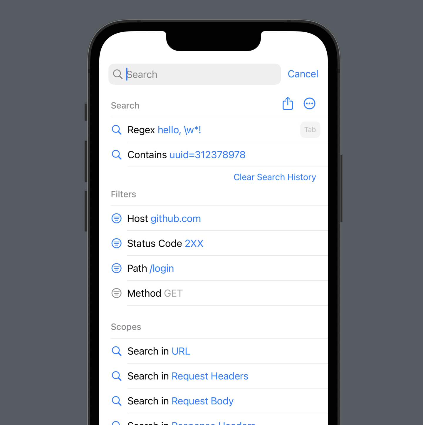
To start using the new search, simply press “Tab” to focus on a search field, and start typing. It will automatically suggest relevant filters, auto-complete certain entries like domains, and search in multiple scopes like response headers and bodies.
Search is just one of the features introduced in version 3.2. So let me show you the rest. This is super exciting because this release is packed with features.
I will cover some of the
.searchablebasics in the article, but if you just want to learn the API and are not interested in Pulse, go through the Apple’s “Adding search to your app” article instead. It’s one of the best new articles – love it.
Searchable #
When you open search for the first time, it shows you a list of available filters and search scopes. And if you’ve used one before, it’ll be on the top of the suggestions list with a prefilled value. Hit “Tab”, and it’ll add the suggestion filter. Or hit “Return”, and it’ll use the input as a plain search term (or wildcard, or regex).

To add a search bar, I use the new API introduced in iOS 16 that supports tokens and fallback to the previous API on the earlier versions:
struct ConsoleView: View {
    var body: some View {
        ConsoleListView()
            .searchable(text: $viewModel.text, tokens: $viewModel.tokens, token: {
                Label($0.title, systemImage: image)
            })
            .onSubmit(of: .search, viewModel.onSubmit)
    }
}

struct ConsoleListView: View {
    @Environment(\.isSearching) private var isSearching

    var body {
        List {
            if isSearching {
                ConsoleSearchableListContent(viewModel: viewModel)
            } else {
                ConsoleRegularListContent(viewModel: viewModel)
            }
        }.listStyle(.grouped)
    }
}
There is a way to track when the search is enabled with the
isSearchingenvironment variable, but there is one gotcha: it has to be added in a subview of the view where you add.searchable. It’s readonly which is a shame.
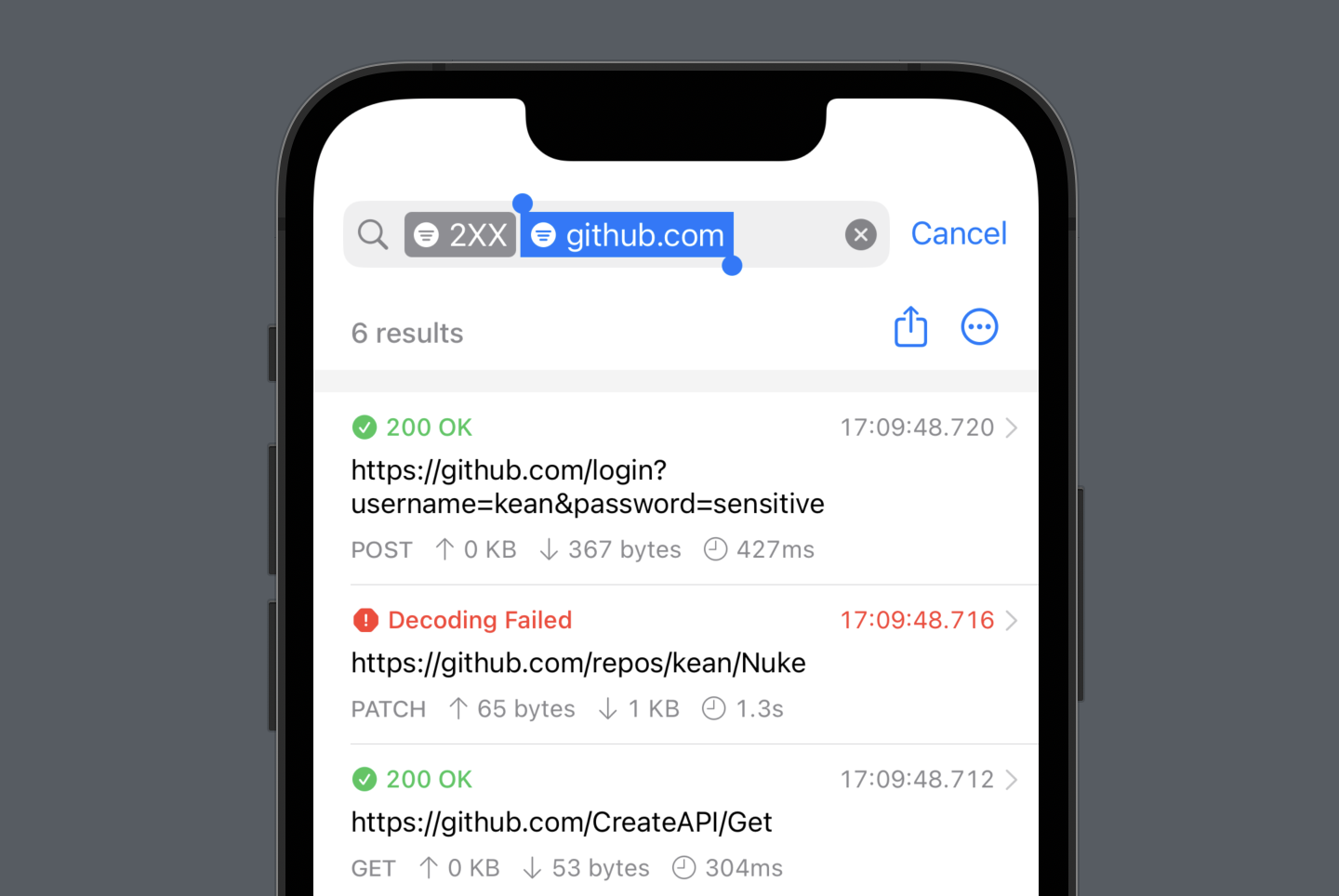
When you select the “tokens”, they are displayed directly in the search bar, and you can easily remove them. It’s a nice feature because it saves a lot of vertical space and is consistent with many other apps on iOS, e.g. Mail.

SwiftUI also provides a default UI for displaying suggested search tokens (
suggestedTokens), but it’s a bit limited and covers the entire screen.
Suggestions #
Pulse is smart about the suggested filters. Just to give you a few examples:
- Start typing
2and it recognizes it’s likely the beginning of a status code and suggests:Status Code: 2XX. You can also specify status code ranges:200-300,200..<300– it recognized multiple formats. You can also specify a list instead:200 203 204. Or make it comma-separated – whatever works for you. - Start typing a host from one of the requests, and it autocompletes it.
- Start with
/path, and it recognizes you want to search by it.
How does this stuff work? I used parser combinators from my other project – Regex. You can learn more about them in one of the older articles. It is by far my favorite programming technique. I slightly modified the parser for Pulse by adding fuzzy matching and non-strict grammar.
Scopes #
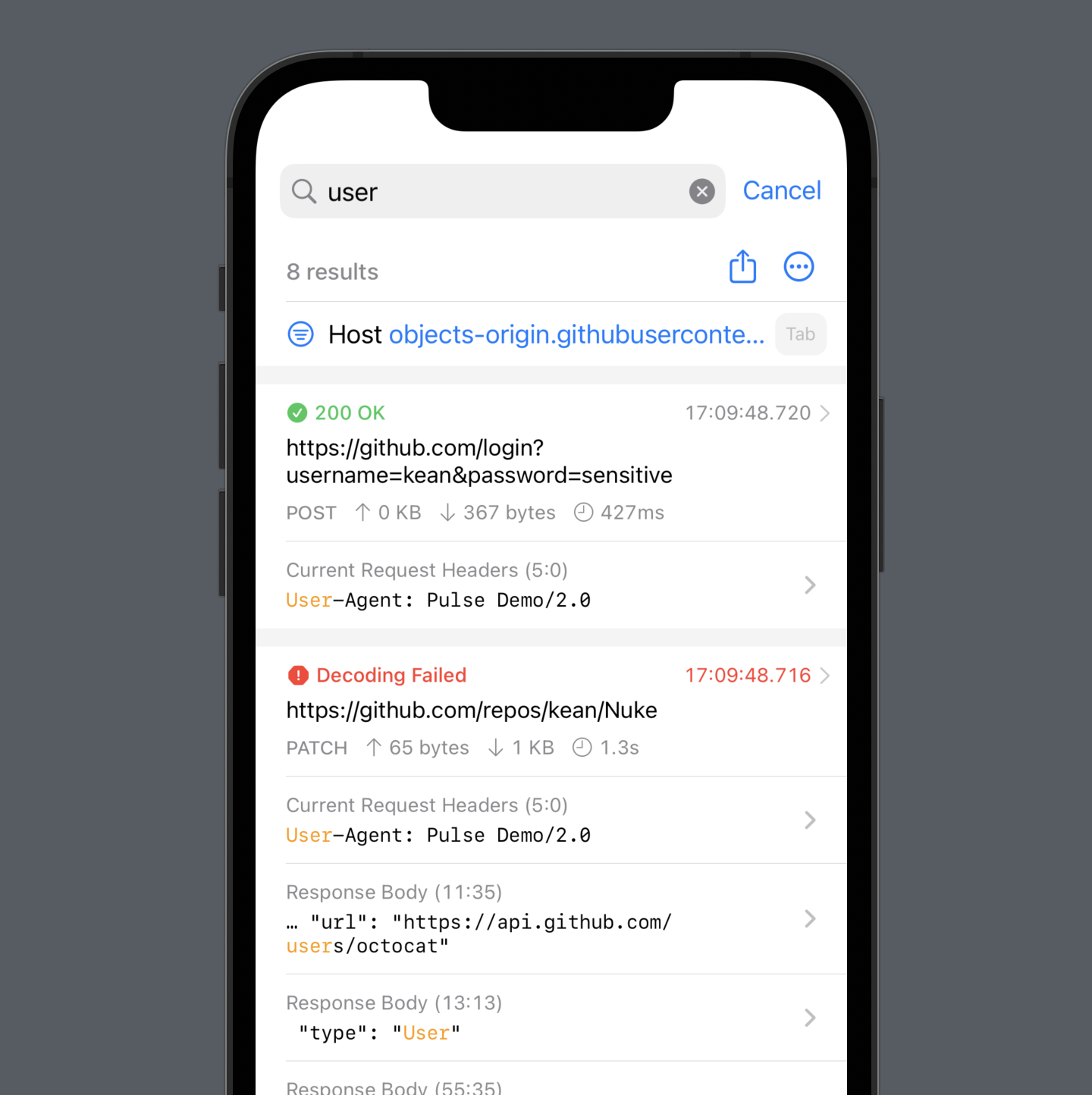
Pulse searches in multiple scopes in parallel: request and response headers, bodies, and URLs. You can also select what scopes to use if you don’t need all. You can see all the matches in the results list, and when you select one, it opens the response viewer, highlights the matches, and scrolls to the selected one.

This new search streamlines many user scenarios. For example, let’s say you need to find a userId value from the /login response. Previously, you had to know the name of the path and search for it: /login, then open the response body, search again for userId, and only then do you see it. Now you just search for userId, click it, and you are done.
List #
List is known for its performance issues. Unfortunately, it was a deal-breaker for Pulse where I need to display hundreds if not thousands of messages and do it in the reverse order with the newest ones constantly getting inserted at the top. So I switched to UITableView and NSTableView, but kept using List on watchOS and tvOS.
Previously, I only needed to display two types of cells, but now, I needed to introduce filters, scopes, new section headers, and, of course, cells for the search results. I didn’t want to pile onto the technical debt. So I had an idea. List is slow only when you display tons of cells. So let’s just not. In version 3.2, I limit the number of displayed items to 1001 and extend the list when the user scrolls close to the bottom – simple.
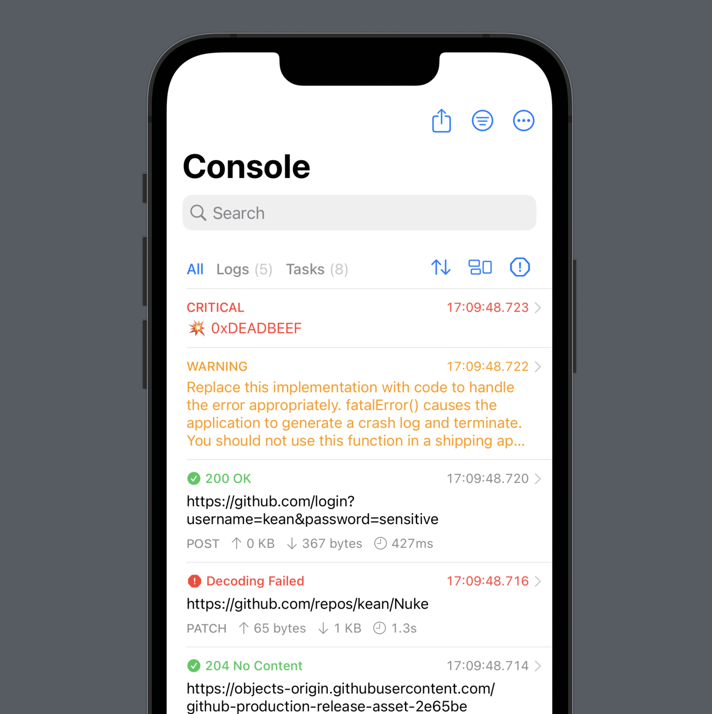
With these changes, I was finally able to use List on iOS and macOS, remove a lot of duplicated code, and while at it, I also introduced a slightly refined design for cells that is now consistent across platforms. There is also a new toolbar because I knew switching between regular messages and network requests needed a prime spot. You now also switch to “Logs” and see only plain messages without requests, which is new.

I’m happy with this approach, but I wish there was a native solution. I’m suspecting, there is no need to diff all the elements to animate the changes on the screen. Or, at least, please, please, give us the option to disable the diffing.
Sort By and Group By #
When reviewing logs, you often want to find answers to certain questions. For example, what are the requests that took the longest? What transferred the most data? Which ones returned HTML instead of the expected JSON? With version 3.2, you can now easily find answers to these and many other questions thanks to the new “Sort By” and “Group By” features available directly from the toolbar.
The grouping I’m particularly excited about is “Group by Session”. It’ll show you a list of all your app’s sessions, so now it’s super easy to find logs from one of the earlier sessions. The groups are also infinitely nestable: you can create a group, open it and create a group from the selected logs, and so on.
Pins #
And last but not least, Pulse now has a proper replacement for the Pins tab that was removed in version 3.0. It took me a while to finally realize the obvious: it’s in the name – just literally pin them to the top.
Final Thoughts #
I love building things, especially when I have full control over all aspects of the process. With Pulse, with a limited time, I try to work in quick bursts where I try to make a few good decisions to move it forwards and focus on them. I usually follow the make it work → make it right → make it fast mantra, and with SwiftUI, prototypes are often indistinguishable from the implementation, which is a massive time-saver.
The new search and other list features make Pulse infinitely more useful. They are available today on iOS and are coming soon to other platforms. I hope you give it a try!
-
This new approach with
Listis actually kind of perfect for one more reason. The diffing introduces a problem that is a bit more subtle. WhileListdoesn’t display all cells upfront, it needs to know the identifiers of all the displayed entities upfront. That’s a problem if you are usingfetchBatchSizeto reduce the number of database calls. But if you only display a slice of entities, and if the size of the slice matches yourfetchBatchSize, it works as expected: there is only oneSELECT * FROMwhen you open the page: see my Core Data logs before and after. ↩